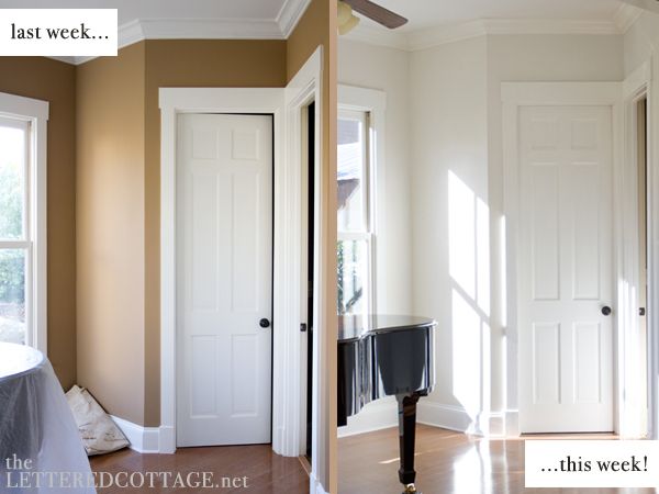
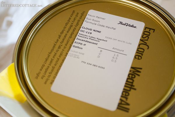
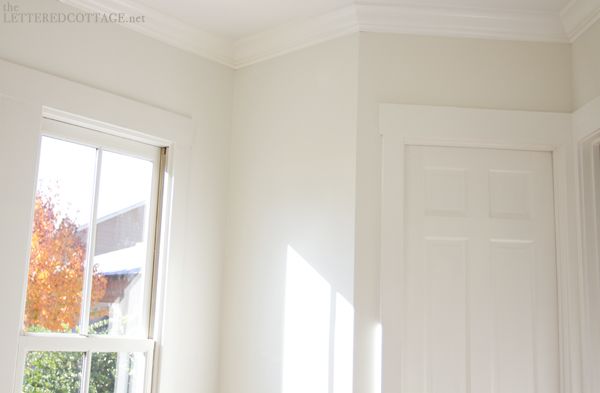
We made a quick trip back to True Value to pick up wall paint for the sunroom last Thursday afternoon. After sampling a handful of other off-whites, we settled on a Benjamin Moore color called Cloud Nine because it was the exact gray-to-white-to-warm ratio we were looking for.
I love the color and the name. I’m kinda funny about those kinds of things. Paint names, I mean.
Are you a sucker for ones that sound pretty, too? (Mom- I know you’re nodding up and down right now!)

We’re planning to pop some warm textures, and fresh & fun, cottage-y colors into the space in the weeks to come, and we look forward to blogging all about ’em when they’re in place and poppin’. Here are some photos of things & ideas, and colors & textures I’ve been having fun drawing inspiration from lately…
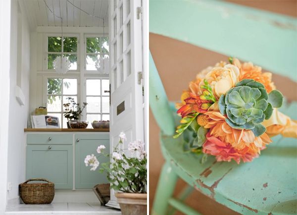
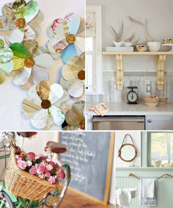
(Foyer Photo, Chair Photo, Sugarboo, Shannan’s Wreath, Kitchen Photo, Bike Photo, Bathroom Photo)
Here’s hoping I can squish a whole bunch of that kind of inspiration into a DIY bottle and bring it to life in our sunroom!

This post is part of our 2012 True Value DIY Blog Squad series.

“Truly Valuable” links:
Twitter.com/TrueValue, TrueValue.com, StartRightStartHere.com, TrueValuePaint.com, Pinterest.com/TrueValue, YouTube.com/TrueValue. You can also find more info about True Value DIY Blog Squad on True Value’s Facebook page. We’ll be hosting an “Ask The Blog Squad session over there on December 18th!

Legal stuff: We were selected by True Value to work on the DIY Blog Squad and have been compensated for our time commitment to True Value-related blog posts. We were also given a gift card to purchase the materials needed for our True Value-related projects, however, our opinions are entirely our own and we haven’t been paid to publish positive reviews. Boom!

i totally have to love the paint name too…or it is a no go. lol
looks wonderful!
I always wanted to have the job of naming the paint colors. HOW GREAT WOULD IT BE TO GET PAID FOR THAT??!!
Love the colors. I am a color expert with a funny obsession with the names too! Glad I am not the only one! Can’t wait to see the rest of the room “Palmerized”! It is going to be great, no doubt!!
Pretty sure if anyone can bring home that inspiration in a bottle, you can!
Looks fabulous! I made that wreath from magazines with the penny center! So fun! Can’t wait to see how you put it together! 🙂
HAHA!! I always have a reeeealllly hard time when I get down to a choice between two colors – and I’m leaning toward one, but like the name of the other!!! (I’ve probably never said that out loud before because I thought it was just me!)
LOVE the new look in the sunroom – I’ll be smiling when I see your matchstick blinds!: )
Leah: )
Love, love, love, love, love, love it!
Did I mention I love it?!
Cannot wait to see progress!
Hi there, Layla! Love the colors you’ve chosen. Can’t wait to see how you put the wow factor in your beautiful new home! I am trying to get to the article about the wreath you displayed above. I went to Shannan’s blog, where she sends us to your magazine for the instructions. I can’t seem to get it to open properly. Ads show, but none of your text or photos. At the bottom it says “Error in opening.” SO, I came back to your blog, thinking maybe she just had a problem with the link (Sorry for doubting you, Shannan! :-O) , but I have the same problem opening from your link on the left side of your blog. I’m thinking the problem must be on my end. Do you, by any chance, have any suggestions for this simpleton on how to view your magazine? 🙁 Thank you for any help you might be able to provide! Keep on painting!
I love that paint color! The room is already drastically transforming. The amount of light in that space is unbelievable.
It’s like heaven!
Enjoy your slice of heaven today
Cheers!
I’m not going to lie, I was a little disappointed when my favorite Benjamin Moore dark gray that we have started to use everywhere turned out to be called “Gray” … seriously. Did they run out of nouns to append to the end? Just Gray? … Oh well, we love the color so there’s that. Maybe if I call it Gray 2121 (it’s numeric suffix) it will help ? … Like it’s the gray of the future?
I’m the same way with paint names. Like our paint in the living room is “Main Street USA” which is kinda cute and quaint. We used to have “Kitten” in the kitchen but since we had “Moonstone” leftover from the guest room, I repainted the kitten with the celestial covering. 🙂
I didn’t dislike before (though that’s the exact same color as my guest room and I’ve been itching to repaint it since I moved in two years ago) but the after is so much better! Can’t wait to see what’s next.
Oh, my heart skipped a beat when I saw those first two inspiration pictures! They are gorgeous!!
I love the lighter and brighter colors you’ve chosen!
I LOVE the airiness!!! Great job! 🙂
Wow! What a huge difference the lighter color makes! I recently looked at a paint named “Baby Elephant” and it looked just like that 🙂
Love the colors! I, too, doing my sunroom makeover. I just might copycat yours! JK! I painted the walls satin white with gloss white for trims/moldings/”beadboard” ceiling. I will post the makeover in my blog soon for you to see! Thanks for sharing yours and congrats on your new home!!!
The “before” color of your sunroom looks exactly like the color I have in my kitchen and dining room. I just painted the walls below our chair rail white, hoping that would be a quick fix to brighten the space up and it worked, but I’m still craving something lighter on top. I LOVE Cloud Nine… hopefully I can get my hubs on board sooner rather than later! 🙂
It’s so pretty!! What a difference!
For me, it’s always difficult to be sure of my paint. Even if the color painted on the lid seems beautiful, I’m often deluded when I paint walls.
But I’m rarely deluded my all kind of white and grey.
my friends have been giving me a hard time because i love white (white-ish) walls and refuse to paint some trendy brown or grey or red. this post thrills me to the bone to see you take a (lovely) brown wall to white. thank you, thank you! really looking forward to seeing the colors you pop around the room.
by the way, the colors of the flowers on that chair make me wildly happy. no reason why, but they do. just had to share.
happy monday.
I love love LOVE crisp white trim with creamy walls. Love it. If you add touches of faded grey/blue/aqua and some gently worn, cozy elements I may go weak at the knees. 😉
Paint names are a big thing for me too! My husband and I met at a hockey arena, my office is currently at a ice rink complex and my husband is a hockey referee……are room is painted….Ice Rink!
Beautiful! A new color made a world of difference!
Ditto on selling me by the name of a paint color….it will help me choose a color every time if I am undecided!!
I once sold my husband on a paint color by the name: Single Malt.
That is THE PERFECT color of soft gray, Layla! You two are amazing at picking out the right paint for your transformations. I can hardly wait to see how it all comes together! LOVE your blog and your amazing make-overs!
xoxo laurie
♪♪ Let the sun shine in…♪♪ That color change really lets the light come in. Can’t wait for the textures and color addition. To me the walls are the canvas and what you put in the room is the artistic inspiration. Have fun!
love those inspirational photos! i can definitely see how your room is already going in that direction.
excited to see more progress… keep it coming 🙂
Can’t wait to see what all that fabulous inspiration leads to. I love your wall color choice! I’m sorta a sucker for the name to. In our last house I painted the living room Ralph Lauren Haybail. I was head over heals for the name, but I knew with the first roll of the roller I made a lil mistake, great color, but way too dark for the room. I lived with it for 3 long years!
I love cloud nine! Oh yeah. The paint color has to have a pretty name for me also. Gray Owl just seems scary to me.lol BM has a beautiful blue called HEAVEN ON EARTH. Have not tried it yet, but it is definitely going in one of my bedrooms!!
Lookin’ awesome, friend! Such a talent you have, can’t wait to see it come alive in your space! XO!
I always wondered what it would be like to be the one who names colors for Crayons and paint. Do you think it’s a full time job? I could do that.
I LOVE this COLOR!!!! Choosing paint color has got to be one of LIFE’S most difficult decisions..lol! You make it look so easy… can’t wait to see the room come together. Bless you both in your new home! 🙂
Love the paint color! Definitely goes with the cottage-y feel! Can’t wait to see it complete!
Oh, lordy, Layla — fresh is your middle name!! Can’t wait to see it poppin’… the wall color is the perfect backdrop for all your magic touches. 🙂
xo Heidi
Looks great, and LOVE the name! You guys sure aren’t wasting any time in the new place 🙂
What a relief that that brown color is gone!
i love paint color names! most of my house is “cozy cottage”, except my garage is ‘chocolate froth”…mostly just because i love those names!! ha!
I can not wait to see this room finished and dressed up!
Is the color on the wood ceiling the cloud nine too?
Love your new home!!!
No, the color on the ceiling is just off-the-shelf white paint. 🙂
Love the new color, your piano (even just the little corner peeking out) really comes to life in there now!
Love the new color!! So inviting! Your comment about loving the name color cracked me up. BM’s “serenity” won in a recent panel of paint options in my laundry room based 95% on name alone. Who doesn’t want some serenity in a chaotic laundry room. Ha!
Oooh, pretty! Love how bright it looks.
Thank you for sharing your perfect white-gray-warm paint. Just what I’m looking for. I hope it works in my space too. (Mine is months from the paint stage, but I’ll keep it in mind.)
You two are amazing! What energy! Love it!
I’ve been trying to decide the colors for a rather dark basement bedroom, I think you nailed it for me. I just love it, Thanks!!
Too funny about the paint colors! I just painted my office and I wrestled because I could not give up SW’s ‘Patience’ but finally I had to let go – it was just a little too light – and go with SW ‘Maison Blanche”
great paint names are a bonus to beautiful colors! love the color and the design inspiration photos. I think we have very similar taste…so I can’t wait to see what you do and I’m ready to be inspired!
OMG I am NOT the only one…when we built our house about 9 years ago, I HAD had had to like the name of the paint color or I just couldn’t do it. Everyone thought I was silly, Ya just gotta like the name ( and the color of oourse) 🙂 Things are looking so nice, look forward to more views.
Ha, I totally pick paint colors the same way! Well, I actually pick them by color, but usually if it’s between one color and another, I choose based on name. We picked the color of our bedroom (New York State of Mind, Benjamin Moore) because of the name (we are both from NY, and hope to return to there soon), so we thought it was fitting to paint the room where we dream with that color! 🙂
The color is absolutely lovely! 🙂
Shannon
Fabulously Vintage