I blame Erika’s Instagram feed.
Especially these two pictures:
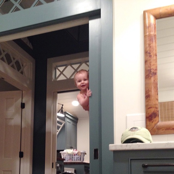
(ErikaMPowell on Instagram)

That’s Martha Stewart’s “Gabardine” on the trim and cabinetry in her bathroom, and Sherwin-William’s “Rosemary” on the cabinets in her kitchen. (And those are her adorable (and clearly very talented) kiddos!)
Seeing those insta-pics triggered a spontaneous run to Home Depot for paint samples yesterday. I just had to see what her colors would look like on our (currently mustard-colored) kitchen island! (Even though we’re not exactly ready to make over the rest of the island yet because, technically, it would be smarter to replace the countertop first). #ButHey #AtLeastIDidn’tPrematurelyStartTearingApartAWallAgain 😉

And of course, I had to try out a few other samples too:
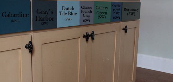
Visitors you’ve been warned, the back side of our kitchen island is reeeeally colorful right now- LOL! 😀
I laid some of my favorite countertop/backsplash tile samples on the counter above each paint sample- just to get a feel for how each color would look in the future:
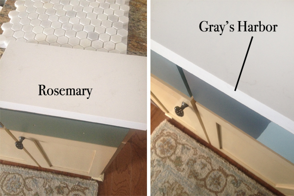
I kind of keep flip-flopping from minute to minute, but as of this minute, and out of these colors, I *think* I’m leaning Rosemary, and Kevin’s *thinks* he’s leaning Gray’s Harbor.
Rosemary:
Gray’s Harbor:
Do you have a favorite?
I’m sort of leaning Gray’s Harbor right now. 😉
Keep in mind, we’d like to paint the cabinets on the other side of the kitchen Simply White. Here’s a link to post that shows how our kitchen is set up, if you’d like to take a gander: Our Kitchen.
I’m thinking once we choose a color, I’ll just go ahead and paint that one color on top of all of those other colors and we’ll just live with a two-toned island for a while.
Hey! It’s better than an 8-toned island, right?
Like I said, I blame Erika’s Instagram feed. 😉

PS- Just in case anybody’s curious: the countertop sample is Frosty Carrina by Caesarstone, and the backsplash tile is available at Home Depot.
…and for more pics between posts, join me over on Twitter, Facebook and/or Instagram!


It seems you tend toward cooler tones, but the warmer Rosemary may help keep things from looking too ‘cool’. But then again, the Gray Harbor would compliment your hex tile nicely… I like them both 🙂
I like the Grey’s Harbor with your tile and counter choice. I think the Rosemary is quite pretty but may feel dated after awhile whereas the grey sort of reads as a neutral to me.
The Rosemary is beautiful. I think you would walk into many kitchens and see a color close to Gray’s Harbor, but Rosemary is more unique. And, I must confess, as one that works in a gray building, I have NOT jumped on the gray bandwagon. Even though many shadings, too institutional for me. With all the beautiful scenery outside your home, the Rosemary will look stunning from the outside looking in. More of an earth shade. And, I really like the tile and backsplash with it.
I’m a big fan of rosemary. It’s warm and inviting and an actual “color.”
totally in love with that rosemary! bet it would rock in your kitchen.
i love your “fly by the seat of your pants” attitude when it comes to the house.
🙂
Gray Harbor is beautiful!!
Hi Layla, I’m with you – I love the Rosemary!
We recently painted our bathroom cabinets with SW Pewter Green – the swatch looks a little more gray, but in person it’s pretty close to Rosemary – and I’m obsessed! I know you’re supposed to be narrowing down your paint choices, not adding to them, but you ‘ought to pick up a swatch for Pewter Green. A little gray, a little green – so you and Kevin can both get what you want!
I like both of them too but I initially went for the Rosemary so I’ll stick with that.
I like Rosemary, but I like all the rooms you do so whatever you choose will be beautiful. I follow Erika on Instagram too. She’s amazing!!
Rosemary is BEAUTIFUL – GO FOR IT!!!!!
Leah: )
I have to go with Rosemary!
I like the Rosemary more just because I think the Gray’s harbor is a little too dark. Both are lovely so either choice will be great though. One great thing about paint – it can always be changed. BTW…That Erica Powell has a pretty fab kitchen and some gorgeous transoms.
Ooh, how fun! You can’t go wrong here. The rosemary will be a little lighter and brighter. The gray harbor is a bit more neutral. What accent colors are you thinking of for the space? Maybe see which ones look best.
I like the Rosemary, but I say whoever spends the most time in the kitchen gets the last word!
Gray’s Harbor for sure!
Oooh, I like the gray harbor best. I have a not-so-secret love affair with all kitchens that are gray and white. Unfortunately, mine is contractor grade brown with brown speckle granite:( It makes me sad every time I look at it. Thanks for keeping me inspired. Gray Harbor all the way:)
As my son,Colby, says( he manages a paint store in Medford Oregon), it’s only mud! Paint it and you can always re paint if you need to! To me both colors are nice. Considered a different hue? Lighter hue of blue? Light hue of green? Can’t wait to see what you pick..
Love the Rosemary! Beautiful with your countertop and backsplash choices!
Gray Harbor hands down.
I would go with Rosemary – EVERYONE and their brother is painting EVERYTHING gray – do something different – plus, I lean more toward green anyway 🙂 Love to see what you finally decide on.
I can’t stop going back and looking at that Needlepoint Navy. I think I’m in love.
Everyone is going with gray cabinets right now and I love the Rosemary so I would go with it!
I would pick a sage green. A little less green than Rosemary and picks up the grey in the Gray’s Harbor
Gray’s Harbour only because I’ve had green for 15 years and I’m tired of it. Which has absolutely nothing to do with you or your home!
I vote for Gray’s Harbor
ROSEMARY is stunning! Love it!!
I’m gonna have to say Rosemary! Gray Harbor is great, don’t get me wrong, but I feel like you’d always ask “WHAT IF we had gone for the Rosemary.” 😉
Rosemary! “There’s rosemary for remembrance; pray, you love, remember …” (or some semblance of that … long time since my Shakespeare classes!)
I think the Rosemary is perfect!!! Maybe you could use one in the kitchen and find a place for the other one somewhere else! 🙂
I’m loving Rosemary! But which ever you choose will be beautiful.
I like Rosemary, its looks more like the vision from your “one room , three ways” . Love it!
Hands down, Gray’s Harbor!
Both are beautiful, but Gray’s Harbor is my pick. I think the color will stand the test of time, and it would look great with the tile
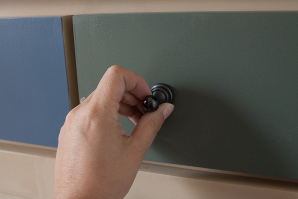
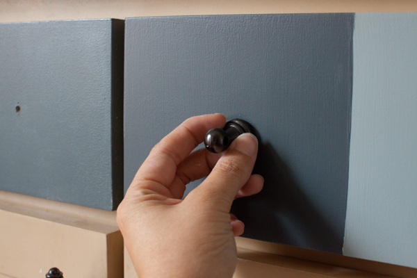
I was leaning to Rosemary… Even before you said you were. But after seeing it with the door pulls I like Gray Harbor better. Hopefully, you decide soon so we can see some more “After” shots. No pressure. 😉
I just painted our lower cabinets BM Statton Blue and it’s the most gorgeous color ever!
Go with the Rosemary, it reminds me of the outdoors. Besides, everyone has a gray/blue tone to their home. You need to be different.
I like seeing your thought processes and progress. Thanks for sharing!
I like both colors but the grey harbor is my bet. rosemary has a bit of greenish tint look.
Definitely Gray’s Harbor!
I love them all but really love Gray’s Harbor
I just painted my cottage cupboards gabardine blue and they are beautiful!!!!
I have that same “problem” every time I look at Erika’s pics, haha! I absolutely love her work and every time I see something new I get a new idea– it’s so fun!
Tough choice between the two, but I’m leaning toward Gray’s Harbor, too.
Can’t wait to see what you choose!!
Grays Harbor! Its pretty and the name of the County I live in 🙂
I like both colors, but I’m just stoked to see another sweet Sloane out there. My 16 month old daughter is a Sloane 🙂 Once I saw the name paint colors became fuzzy to me – ha!
I selected Grays Harbor even before I saw your choice. I love the color AND live in Washington State where we have a County with just that time 🙂
Greys Harbour! it can be a neutral grey when you want, or you can bring out that blue too….accent with yellow flowers and accessories…so fresh in spring and summer.
Im thinking gray’s harbor compliments your wall color better in adjoining room. curious if the rosemary looks good with gray owl? In your picture, the wall color looks a bit off with the rosemary painted cabinet. Does it in person? Wondering where I can use rosemary in my house!
I like both, but I think the gray is a little more timeless.
ROSEMARY!!!! Make a commitment! Gray’s Harbor is too SAFE!
Rosemary for sure! Gotta love GREEN!