I blame Erika’s Instagram feed.
Especially these two pictures:
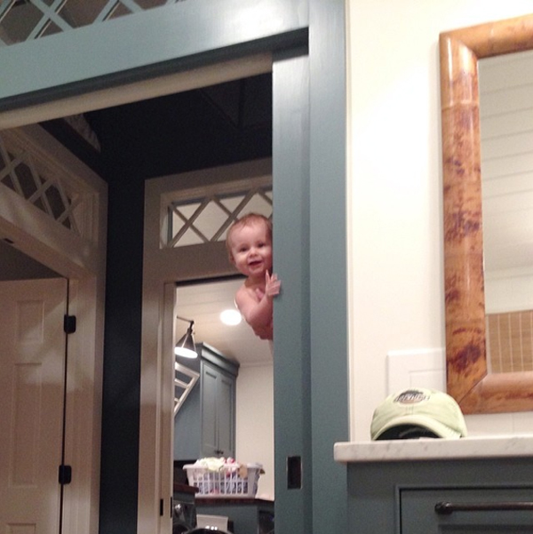
(ErikaMPowell on Instagram)

That’s Martha Stewart’s “Gabardine” on the trim and cabinetry in her bathroom, and Sherwin-William’s “Rosemary” on the cabinets in her kitchen. (And those are her adorable (and clearly very talented) kiddos!)
Seeing those insta-pics triggered a spontaneous run to Home Depot for paint samples yesterday. I just had to see what her colors would look like on our (currently mustard-colored) kitchen island! (Even though we’re not exactly ready to make over the rest of the island yet because, technically, it would be smarter to replace the countertop first). #ButHey #AtLeastIDidn’tPrematurelyStartTearingApartAWallAgain 😉

And of course, I had to try out a few other samples too:
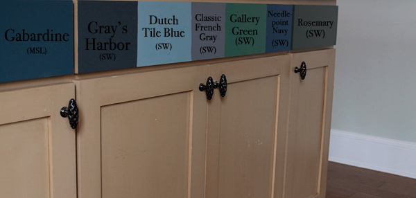
Visitors you’ve been warned, the back side of our kitchen island is reeeeally colorful right now- LOL! 😀
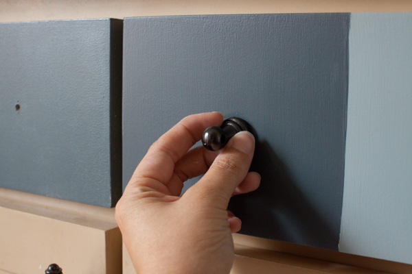
I laid some of my favorite countertop/backsplash tile samples on the counter above each paint sample- just to get a feel for how each color would look in the future:
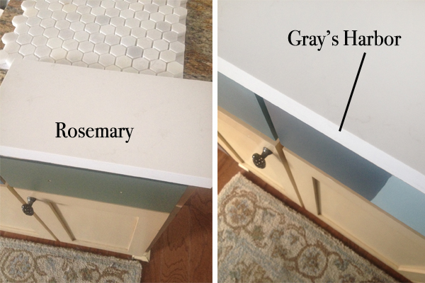
I kind of keep flip-flopping from minute to minute, but as of this minute, and out of these colors, I *think* I’m leaning Rosemary, and Kevin’s *thinks* he’s leaning Gray’s Harbor.
Rosemary:
Gray’s Harbor:
Do you have a favorite?
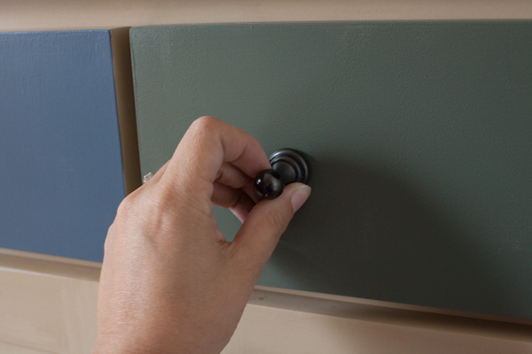
I’m sort of leaning Gray’s Harbor right now. 😉
Keep in mind, we’d like to paint the cabinets on the other side of the kitchen Simply White. Here’s a link to post that shows how our kitchen is set up, if you’d like to take a gander: Our Kitchen.
I’m thinking once we choose a color, I’ll just go ahead and paint that one color on top of all of those other colors and we’ll just live with a two-toned island for a while.
Hey! It’s better than an 8-toned island, right?
Like I said, I blame Erika’s Instagram feed. 😉

PS- Just in case anybody’s curious: the countertop sample is Frosty Carrina by Caesarstone, and the backsplash tile is available at Home Depot.
…and for more pics between posts, join me over on Twitter, Facebook and/or Instagram!


they are both nice but I think I like Gray’s harbor
I like the Rosemary!
I’m liking the Gray’s Harbor…..although the Rosemary is really nice too. I don’t think you can go wrong either way.
I have a friend who did something close to the Rosemary and it is beautiful!
Leaning toward Gray’s Harbor, but both would be pretty!
I think I’m going with Kevin’s pick. Gray’s Harbor……
I am liking Gray’s Harbor too, but Rosemary was my second choice 🙂
Gray harbor
I just went on Caesarstone’s website and pinned that countertop material. It’s gorgeous and would be perfect for what I have in mind for our island/peninsula.
Oh – I like Gray’s Harbor! 🙂
Rosemary! Gray Harbor seems expected…sort of a safer choice too. If anyone can pull off greenish kitchen cabinets its you two!
Rosemary for the win!
I am thinking the gray as well… It just looks “cleaner” next to the tile and I love the way the knob looks with it.
I think Rosemary is the more unexpected pick. So if you want to do something like that, I’d go with Rosemary. I personally like Gray’s Harbor better but more so because I love gray and I tend to play it safe when painting. But! You are only painting the island so that’s less of an investment.
Not to muddy the waters for you but have you ever used SW’s Silvermist. I have it in my kitchen and I LOVE it. It’s a perfect blue-green-gray.
I like Rosemary, but my opinion keeps switching. I’m sure whatever you decide to do will be gorgeous, though!
Gray’s Harbor!! Love the backsplash sample.
Definitely Rosemary! Pretty!
Green is more calming to me…but that’s just me.
I am definitely on board with Grey’s Harbor! Gorgeous color! How fun!
I vote Rosemary!
Layla, THANKS for making me laugh with you posts! You guys are too adorable! I LOVE the gray! Actually truth me told they are both lovely colors and I’m sure you’d make them both look FANTASTIC!
And let’s say a whoohoooo to good news around the corner for sweet P . . . . . :). Stay well . . .c
I like the Gray Harbor…the Rosemary is nice, but in the picture, it seems to have more of a green hue. Anyway, happy deciding!
You always manage to surprise me with your color sense! I would never have thought about going that dark again with cabinetry, considering I lived through the 70’s and 80’s and 90’s….well you know…..and I have managed to get all my dark painted stuff repainted with lighter, brighter colors. Then….here you go….my color and all things lovely hero….trying out darker, richer colors. I love them again! My vote is for the other color that’s not rosemary. I’m really, truly over green.
But you might talk me into it again. I heart you.
Mz V
Gray’s Harbor is my vote.
Gray’s Harbor
Love, love, love Rosemary! Now I want a contrasting island…better GET an island first
Rosemary! Both, well really all the colors are beautiful–but I am with you on the Rosemary. Gray’s Harbor is so expected, and I love the idea of choosing something more my own. The Rosemary is a tone that will coordinate with many other colors–go for it!! Can’t wait to see what you do…
Oh how fun! Gotta say I wish your kitchen redo was further up the list because I’m looking for inspiration and you guys do such a great job! I like them all, honestly. You won’t go wrong either way! Good luck and have fun with it!
Gray’s Harbor all the way! 🙂
I vote for Gray’s Harbor. And I love the backsplash! I’ve got the same sample of backsplash laying in our kitchen . It is just beautiful in person. I always love your decorating taste.
I LOVE the Rosemary! Of course, it is my favorite herb, so anything that hints of it (color, smell, etc) I just love. I have six bushes in my front yard urns alone!
Both are beautiful, but I LOVE the Rosemary and I’m trying to figure out where I can paint that color in my home!
I definitely liked Rosemary until the last two pictures, and it might have been the lighting, but then I preferred Gray’s Harbor. Sorry, I guess I’m no help at all…..but I know that whatever you choose it will be spectacular!
You can’t go wrong with either color, but I’m in love with the Rosemary. I think the greenish hue brings a little more life into the room than the grey harbor. But I have not doubt that whatever you pick, you will make it look fabulous!
I am loving Gray’s Harbor but at the same time Rosemary is so unique! If you are looking to stand out and be different I would pick Rosemary 100%!
just painted ALL my bottom cabinets in Gray’s Harbor and LOVE it so much.
Gray’s Harbor!
Rosemary has more vitality and is richer. While Gray’s Harbor is also a statement, it’s almost too neutral, a bit boring. The black hardware gives a perky punch to the Rosemary. Think I’ll paint a feature wall with the Rosemary. A tone close to Rosemary is my accent color. It’s amazing how many colors complement it. Thanks for the inspiration!
Gray’s Harbor. I picked that color before even looking at all the other pics.
Ohhhh Gray Harbor would compliment that charcoal gray chair in the living room nicely! Either way, both colors are fab! 🙂
I was all Rosemary until the end of the post. Now I’m all in for Gray’s Harbor! Can’t wait to see what you decide!
I agree. I liked Rosemary until I saw the last pic. It looks very 90’s/forest green in that shot. So my vote is for Grays Harbor
Gotta go with the Gray’s Harbor. It’s stunning, especially with your countertop sample. Yowza!
I think you painted OUR cabinets something close to Rosemary, and we still love them!
love ya’!
Definitely, hands down Rosemary!!!! I need to mark this down for when I want to redo my cabinets.
I prefer the Gray’s Harbor. I have simply white in our home and love it.
Best of luck with your choice Layla &(Kevin)
I’m sure it will be wonderful either way.
Penny
Wow! what a decision. Both would look awesome but I think I like the rosemary a bit more.
If you have doubts, maybe you haven’t found the right color yet. Unfortunately, there are only about two million plus other choices. But you will make the right decision- so far you have.
Love the Gray’s Harbor, especially if you’re keeping the rug in there. (Is that the PB Kate rug?)
I like both but definitely prefer Gray’s Harbor 🙂
Gray Harbour
OK That baby peeking out of the doorway is the Cutest!!!
Both colors are great! I guess you have to decide if you want green or blue in your kitchen, Good Luck! Can’t wait to see what you choose.
I’m leaning toward Gray’s Harbor! Love the blue/gray look.
I love the Gray’s Harbor!!
I really love the Rosemary, but I’m thinking the Gray’s Harbor will blend with the Gray Owl on your walls better…hard to tell in pictures instead of person, but I know you have a good eye for color and detail and whatever you choose will end up being perfect. And, it’s just paint, right? 🙂 Can’t wait to see the final results.