Hello, and welcome to another installment of Pick My Presto!
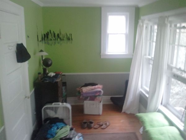
I received an email from a nice young man by the name of Jake asking for some design help with a wainscoting dilemma in his bedroom. His email read:
Hello Layla,
My name is Jake and I am a 16 years old. I’m looking to re-do my bedroom. While asking for advice on my Houzz application, someone recommended you so I checked out your blog and I love it!! You and Kevin have great ideas! I’m looking to add wainscoting to heighten my room because it is extremely tiny…8′ x 16′ to be exact. My question is: what should the height of the wainscoting be?? I want it to be taller. Please help me!!
Sincerely,
Jake
Here’s a photo of Jake’s room…
Move your cursor on and off of the inspiration photo I created below to see it in presto change-o action! (PS- Google Readers will have to click over to our blog to see it switch back and forth.)
(Note: My presto change-o pic is for inspirational purposes only, and the ideas shown in it are just that. Spontaneous, totally flexible, just-for-fun, ideas that may or may not actually work in the room. Boom.)
Here’s a still image in case you weren’t able to view the interactive one above…

I kept the room pretty bare to better illustrate my idea for Jake’s wainscoting question- the rug, dresser and globe are just for fun! Here’s what I’m thinking as far as the wainscoting goes…
Let me start by saying that I 100% subscribe to the idea that contrast (not dark color) is what makes a space feel smaller. So, Jake, if it were my room and I really wanted wainscoting (like you do), I think I’d start by making sure the top and bottom halves of the room were the same color…or at least very, very close in color. That’ll take care of the whole “contrasting colors/textures tend to chop up a space and make it feel smaller” issue because your eye won’t have to start and stop so much. The less visual interruption there is, the bigger your room will “feel”.
Next, I’d align the top edge of my wainscoting, or just a wide chair rail-style trim molding like I used in my drawing, with the small window at the end of the room. That way it’ll look more like it’s always been there. Like it was installed at the same time the window was.
You could also ditch the wainscoting/trim molding idea all together to create “distraction-free” walls, but I think as long as the contrast is low, whatever you do with your wainscoting/trim molding will add character to the room and look lovely! (And, for the record, I vote for wainscoting/trim molding vs. distraction-free!)

Another thing I would do is use roman shades, mounted to the wall above the taller set of windows on the right in your photo. Doing that will create the illusion of more height, and those three windows will look more like one big happy family if they’re (visually) all the same height.
Anywho- as with all my presto change-o’s, these are just the first ideas that popped in my noggin and I sure had fun putting it together!
(Note: In case anyone is interested, I snagged the Tattersall Brown/Taupe Woven Cotton Rug from DashAndAlbert.com, and the dresser and globe came from Pinterest.)
Thanks, Jake! I sure do appreciate the opportunity to dream up this drawing for you!

Would you like to submit a photo for our Pick My Presto series?
Send an email to PickMyPresto [at] aol [dot] com titled, “Living Room“. (Replace the words Living Room with whatever type of room you’re actually submitting.) In the body of the email, include your name, your blog name (if you have one) your design likes & dislikes, and one photo of the space in question. (No links please.) It should be as crystal clear as possible, and measure at least 400 pixels high x 600 pixels wide. (In other words: at least 4″high x 6″ wide) The bigger the better though! Make sure it’s a photo you’re comfortable with me showing and writing about on our blog. Oh, and since I love surprises, I probably won’t email you to let you know I’ve “picked your presto” unless I have a specific question for you about your space.


That definitely makes the room look bigger. LOVE IT!
First of all – I’d love to meet Jake and get to know him before his design skills are blown off the charts and he makes it big! I’m impressed that he used Houzz to check out design ideas and flabbergasted that he wants to redo his room! What a great young man – I can’t wait to see where life takes him!! 🙂
I love the rug you used – D&A makes my heart swell in my chest. I’d like to cover every room in my house with D&A! 🙂
xoxo
i love that just making the windows appear the same height and using the roman shades seems to make a drastic difference! absolutely incredible.
Your suggestions would make a huge change!
Like the others who have commented, I’m pretty impressed that a 16 year old is interested in design. 🙂
Great ideas as always! I totally agree with you! BTW, saw that you’d pinned that dresser, went to ETSY to see it, but it has been sold. WAH WAH =( Guess I’ll have to look locally for something similar!
Very cool! I just redid my 16 year old son’s room and I used Polyvore with him alongside me so he could get the idea of how the room would turn out but the presto-chango is so much better and more fun!
I am impressed with Jake’s skills and knowledge! Neat! I’ve been following your blog for a little while now! It’s wonderful!
I love the way the Roman shades look, but what would you do with the small window? I have rooms with 2 different size windows and it is always a challenge.
Such a great idea with the Roman shades! And that Presto thing is SO cool!
Great ideas! Love those windows. Please send TLC some reveal pictures of your new space, Jake- I’d love to see what you create. Small spaces can be fantastic- just look at Kevin and Layla’s reading room. 🙂
How cute is he? Boy spaces can really be fun to do — you gave him great advice, Layla!
xo Heidi
I know, right? I hope he sends his “after” pics, too! 😀
I love, love, love your Pick my Presto posts! Great job, Layla!
Thank you, Kim! I enjoy doing them so much!
I always enjoy your Pick my Presto! Using the roman shades to raise the windows – how awesome is that!
Thank you, Rebekah! I’m a big fan of that trick! 🙂
I love the paint color you chose for Jake’s walls and am actually looking for a grey color for my walls. Can you make a recommendation based on the color you chose for this room?
Thanks a million.
I love how the dresser is leaning the opposite way of the wall. haha! great post 🙂
Ha! Yeah, things get a little wonky with older homes sometimes! 😀
I love the idea Layla! Thank you so much!!
I will post pictures when my project is complete!
I think this is my first comment here, but I just couldnt resist. Jake, the fact that at 16 you even care what your bedroom looks like amazes me. Not even to mention that as a teenage boy you’re more interested in having a well thought out and designed space as opposed to that “dorm room” feel most teenagers go for (myself included at one time! Just ask my husband about my bedroom when we first met!) is great. I hope you stick with it, you obviously have a passion for it, I’m sure you have a career ahead of you here. Keep it up, I wish you all the best for the future!