Hi there, and welcome to another Pick My Presto post!
This week I played around with a photo sent in by a gal named Jennifer Scott. The email she sent us read:
Hi Kevin and Layla!
Attached is a photo of the exterior of our 1970’s era home. We’ve lived here for 5 years raising our kids ages 11, 7 & 5. In that time, we have busted our chops updating the interior, one project at a time. My hubby is a first grade teacher who didn’t inherit the handyman gene, so we have to save extra long so we can hire everything out.
What to do with this exterior?! Bids just for the siding come in at over $10,000! And those quotes didn’t even address the complete eyesore, which is of course, the brown painted faux stone made out of some type of concrete composite. Got any affordable ideas?!
Thanks, you guys (Minnesota speak for y’all).
Blessings,
Jennifer
—————————————————————
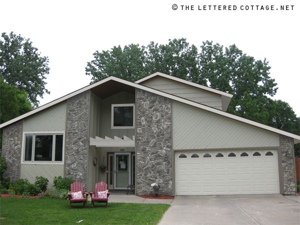
Here’s the photo she sent in for me to presto change-o:
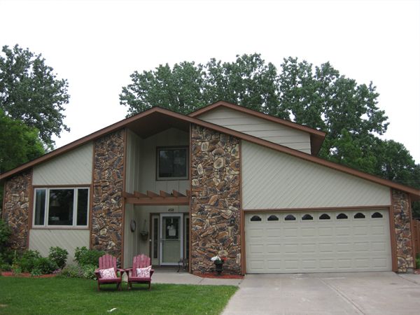
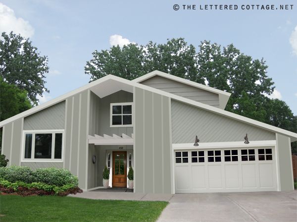
I stared at it for a few minutes and thought- “what if they added more board and batten in place of (or on top of?) all the stone parts? They’ve already some of it cladding the inset area around the front door, so maybe it would look alright on the front of the house too?” I put this drawing together to show them what that might kind of look like…
(Move your cursor on and off of the photo below)
(Here’s a still photo for those who aren’t able to view the interactive photo above)
(Note: My drawings are for inspirational purposes only, and the ideas shown in them are just that. Spontaneous, totally flexible, just-for-fun, ideas. And since this is a just-for-fun-photo-consultation, and not an actual-and-perfectly-to-scale-virtual-consultation, I have no idea if any of the ideas, colors or finishes I used in the drawings would actually work in real life. Boo ya.)
As you can see, I drew in some board and batten to cover the rock parts with the help of my friend Mr. Adobe Photoshop. White side lights and a warm wood front door make the entry area pop a little more, and a new (white) garage door with gooseneck sconces above it give that side of the facade a freshened-up feel. After I popped the garage door in, I drew inspiration from it’s 4-pane windows and added a couple little horizontal pieces of molding to the window above the front door. I like the way it ties those two areas together. And last but not least, I got rid of the little planter area cutting into the sidewalk, and snuck in a couple of big plant pots filled with flame-shaped evergreen topiaries on either side of the door. Again, just ideas. (Take ’em or leave ’em Jennifer!)

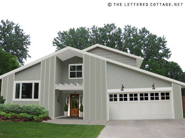
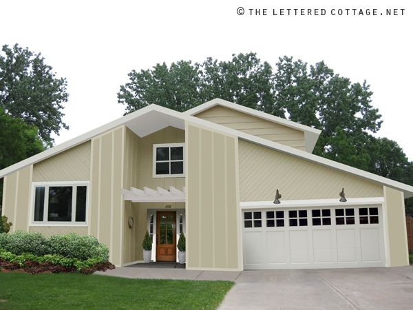
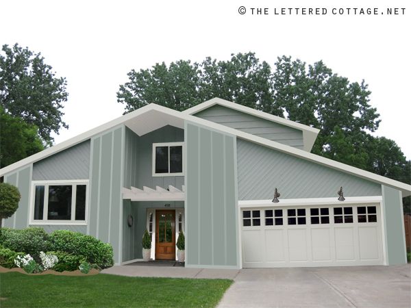
Then I got to thinking- “maybe they’d want to see a few more paint color options, just for fun”. So I put together a few different drawings for them to have a looksie at. First up, a light biscotti color…
(Move your cursor on and off of the photo below to see it switch from before to after)
(Here’s a still photo for those who aren’t able to view the interactive photo above)
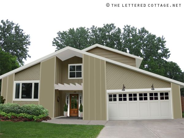
Then a dark beige…
(Move your cursor on and off of the photo below to see it switch from before to after)
(Here’s a still photo for those who aren’t able to view the interactive photo above)
Then a dusty blue…
(Move your cursor on and off of the photo below to see it switch from before to after)
(Here’s a still photo for those who aren’t able to view the interactive photo above)
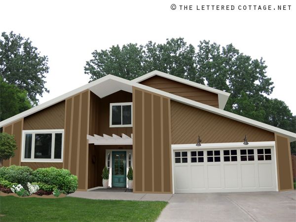
Then, just ’cause you never know what everyone is going to be drawn to, I pulled that color level thing-a-ma-jig in the opposite direction, and tried a warm brown, with a dark aqua-colored door…
(Move your cursor on and off of the photo below to see it switch from before to after)
(Here’s a still photo for those who aren’t able to view the interactive photo above)
OR, maybe just keep it super simple and tone down the stones with some kind of stain or opaque paint (?), for this kind of a look…
My favorite’s the gray one with the board and batten siding…especially when it’s surrounded by a sky full’a blue…
(Move your cursor on and off of the photo below)
(Another still photo for those who aren’t able to view the interactive photo above)
Hope that gets those creative gears a’ turnin’ and thanks so much for the opportunity to pick your presto this week, Jennifer! I look forward to Photoshoppin’ another interior space sometime next week!

Wanna submit a photo for our Pick My Presto series?

Send an email to PickMyPresto [at] aol [dot] com titled, “PICK MY PRESTO- Living Room“. (Replace the words Living Room with whatever type of room you’re actually submitting.) In the body of the email, include your name, your blog name (if you have one) your design likes & dislikes, and one photo of the space in question. (No links please.) It should be clear, and measure at least 400 pixels high x 600 pixels wide. (In other words: at least 4″high x 6″ wide) The bigger the better! Make sure it’s a photo you’re comfortable with us showing and writing about on our blog. Then, whenever I’m feelin’ the urge, I’ll randomly select someone’s email and have a little fun creating some traditional or cottage style presto change-o inspiration. Oh, and since I love surprises, I probably won’t email you to let you know I’ve “picked your presto” unless I have a specific question for ya about your space.

——————————————————————————————————–
Join us on Twitter or Facebook!


————————————————————————————-
Need help arranging your furniture?
Check out my e-book!


Great makeover. I vote for the aqua one!
Layla! Nice job on this one! I would go with gray or biscotti for sure!
OMGoodness! It’s your “afterthought” or “low budget” option that has me at hello. I LUV the one that keeps the rocks, but has them “toned down” with stain of paint. It looks awesome! you didn’t even change out the garage or add the new lighting, and it still looks 200% better! WOW! if I were Jennifer, I’d get moving on that one right away! (Added benefit of leaving the stone? Many potential buyers see stone on the front of a house–even fake stone–as a selling point. So, you may be retaining resale value, while saving money, and gaiing a lot of style!)
I love your ideas! It look much more updated and contemporary. It respects its architectural details and I like that.
I really like the creamy (very light yellow) one. It looks so warm and inviting.
Enjoy your weekend, my friend!
xo
Luciane at HomeBunch.com
I’m lovin’ the gray and the dusty blue ones…oh and the aqua door is fab! 🙂 Great job Layla and much better than a $10,000 quote! Yikes!
Have a blessed weekend!
Beautiful transformation idea! I like the blue and grey. I think they both would look really pretty in the winter surrounded by snow. 🙂 I would pick grey.
Stunning!!! I love these!
I like the dusty blue but the biscotti one is a close second. I hope this helps them to figure out what to do!
…homeowner pick a color that blends better with the stone and paint and invest in better landscaping for curb appeal
GORGEOUS! What a beautiful transformation. I like the grey as well.
So fun!
Love it …what a dramatic change!! I love the gray one the most:)
wow! that is really incredible how it changed it to a beachy cottagy look!
I love this idea! Takes their exterior from dated to fresh in a heartbeat (or cursor flick!). My favorite is the gray, too. Love your vision, Layla!
I LOVE that besides the paint, most of the work lies in covering up the stone and working with what you have! I think this is great bc this should save them money! And by seeing this they know how great it will look!!! Awesome work Layla!
Wow, what an amazing difference! Dusty blue is my fav! I may have to try this on my house to replace the ugly white siding next to my beautiful brick. Thanks for the idea! 🙂
Great ideas!
Very nice of you to help them out! 🙂
Gray…love that and I don’t usually do gray. Nice work Layla!
I also am REALLY liking that you did some of the inside of the peak white, what a dramatic difference that makes!
Another amazing job! I really like the light gray one as well, but it really is remarkable how just “staining” the stones really helps. It’s definitely a great budget-friendly option, or perhaps even a temporary solution as they save up for the big changes. I hope they take this one all the way, though! The gray with the warm wood front door is just stunning.
Really how do you come up with these awesome ideas??!!! The dusty blue is my favorite 🙂
Layla, you are an absolute *genius*! I looked and looked at that picture before looking down at your inspiration and couldn’t come up with a thing. I would pay big money for someone to do the thinking — like that — for me!!! My favorite was the grey too. . .I like the “details” you added — I think that made all the difference. Incredible. . .thanks for sharing.
I agree, I couldn’t even imagine what she was going to do! So cool!
I love the light biscotti color one!
Amazing job, Layla!
Grey with white trim is perfect. I quite like the lines of this home and would love to see the interior! Does the homeowner have a blog??
I instantly thought of the simple fix, just by grey-washing the stones, and I like the texture that they provide. I think that is a DIYable project! I would definitely take it on if I were a homeowner because it doesn’t involve any structural changes.
Love all of the color options, too, but the grey stone is still my fave!!
What great ideas! I like the gray stained or painted stones also. Using the money for a new garage door would give it a whole new look.
Yes, the grey stained “stonework” is an excellent DIY solution. Cheap, easy, and preserves the faux-stone in case it ever becomes retro-chic. The right garage door would work wonders on this site.
We’re currently searching the market for a home, and I’m surprised by how much I am drawn to these 1970s houses. I used to think they were ugly and outdated, but I’m starting to really appreciate them. I have a feeling that in ten or twenty years, those ugly features like the fake concrete stone might actually be desirable. So keep what you can intact.
Wow, I love it! And It doesn’t look like it would be that huge of a job!
I am liking both of the grey houses with and without the stone.
I think doing some kind of stain/wash over the stone and then adding in the rest of your changes is a great look. And as far as cost to do it and future maintenance for a non-handy couple, that’s their best bet. As usual you hit the details perfectly.
Wonderful solution!!! Besides the board and batten, replacing the front door made a HUGE difference…some of the changes they could phase in. If they really want to do more, I think cedar shake shingles replacing/topping the diagonal boards might help even more (stained/painted the same color as the board and batten). It would work beautifully with the gray color.
On another note (but related) Layla, you’ve done the presto-chango things with your exterior right? You know we would all love to see your possibilities!!
kelly in georgia
Yep! There’s a post like that, complete with presto change-o pics, around here somewhere!
And I actually tried the cedar shakes on this house, but it never looked quite right, so out they went! 😀
Oh, here it is: https://theletteredcottage.net/curb-appeal-the-plot
Happy Friday Kelly! 😀
I love your fav too…Perfect! 🙂 You smart cookie!
LOVE your original sketch. It would really transform the house!
Fantastic change! I love the gray and white too. I hope they use your suggestions and then send you a photo so you can post that.
Thanks Marm!
I hope they send in a photo too!!!
😀
Brady Bunch meets The Lettered Cottage! What’s not to love? Great improvement.
Your Friend,
Deborah
LOL! Thanks Deborah!
😀
Love the first option. Not crazy about the other colors, but it looks amazing!
Simply beautiful! I know they will be saving their hard earned teacher pennies to make this happen. I haven’t found a project you have done that I haven’t loved. You have a gift!
Awwww, thanks Debbie! I appreciate your kind words so much! 😀
absolutely stunning! what an amazing transformation. good job!!!!!
I like the gray board and batten the best! The transformation is phenomenal! Way cool!
My favorite is the one you made the change to the stones, it would be a simple and budget friendly idea. I live in a golf course community and some of the new homes that are going up are actually done with the grey stone and they look beautiful.
This might be my fave presto yet!! I really love the idea that 1st grade teacher Daddy off for the summer can paint, even if he’s not handy because even this 1st grade teacher can paint!!
I know you have the great disclaimer about don’t know if it can work etc., but when there are goose neck lights like that above a garage door, do they have to be wired or are there “motion” kinds that work on some big battery?
Love it! You are so talented! It even looks like an affordable project. That is what I love about what you do. It is all very real and something we can actually do. 🙂
I love them all but first one is my favorite. I also love that you gave her the stone painting idea as well, which could be a more affordable option since they have to hire out the work. Beautiful as always Layla! My husband and I love reading your blog! You and Kevin are such an inspiration to us both! Keep up the great work! =D
Angie
That’s great! And, I just have to say (again)… you are SO talented in the Photoshop department! Were you a graphic designer in the past? Anyway… I love how you work in so many of the details, and make it all look so great together!
I love the one with the aqua door! Great job, Layla. You never disappoint!
You are one smart, talented, cute cookie 🙂 I like the one you picked too. What I appreciate the most is all the options you gave them. If they can’t afford the first option they can do the one where they stain the stone, which is an improvement of what they now.
You are such an inspiration. We’ll be moving soon and plan to browse through your website for ideas and inspiration.
XOXOXO
Oh my, this is great. It totally transforms this house and brings it out of the past!
They all look fantastic, I cannot choose a favorite!
I love them all, but the gray is my favorite! 🙂 Great job, Layla!
I like the grey and then the biscotti colors. What a difference it makes!
Layla, you’re incredible!
Love it, always have, hope to use it on a house some day. 🙂
runningtobeskinny.com
these-are-the-days.com
I like any of the lighter colored choices. Changing the garage door and then taking some of those details to the entry and the upper window makes it!!!! Love the changes!!!! (Even though they are only ‘virtual’).
Very clever solutions! The first is my fave and economical. What about a vintage pne door from salvage? A perfect 80/20 blend of modern/antique.
We have a 1970s house and I have done much of what Layla has done with ours-the last one with the dark beige paint is close to what I chose, and I have a black door which stands out nicely. I LOVE our garage door (it is nearly exactly like the one Layla chose but I added black trim detailing to tie in with the door). However, I have to tell you that the garage door was very expensive because it is wood. The impact it has had on the curb appeal has been amazing, though! Scary, but it is my favorite part of our home’s exterior!
I also like toning down the stones with gray and that solution might be more economical. Good luck and have fun!
AWESOME Layla…wow I wish I had just a fraction of your wisdom and talent!!! I love the Biscotti one or for the super cheap…painting the whole thing as it is right now like your greyed out photo…either one works.