Hi there, and welcome to another Pick My Presto post!
This week I played around with a photo sent in by a gal named Jennifer Scott. The email she sent us read:
Hi Kevin and Layla!
Attached is a photo of the exterior of our 1970’s era home. We’ve lived here for 5 years raising our kids ages 11, 7 & 5. In that time, we have busted our chops updating the interior, one project at a time. My hubby is a first grade teacher who didn’t inherit the handyman gene, so we have to save extra long so we can hire everything out.
What to do with this exterior?! Bids just for the siding come in at over $10,000! And those quotes didn’t even address the complete eyesore, which is of course, the brown painted faux stone made out of some type of concrete composite. Got any affordable ideas?!
Thanks, you guys (Minnesota speak for y’all).
Blessings,
Jennifer
—————————————————————
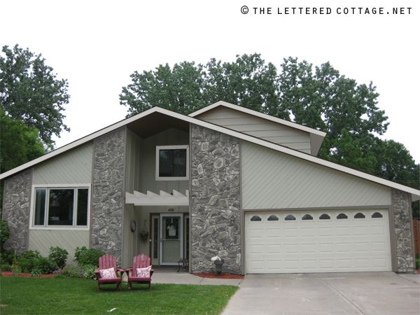
Here’s the photo she sent in for me to presto change-o:
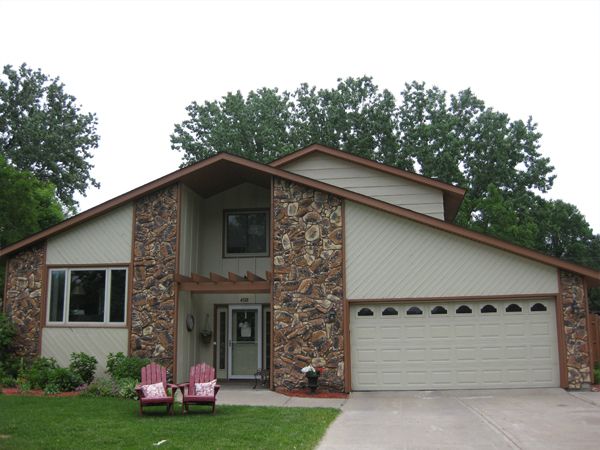
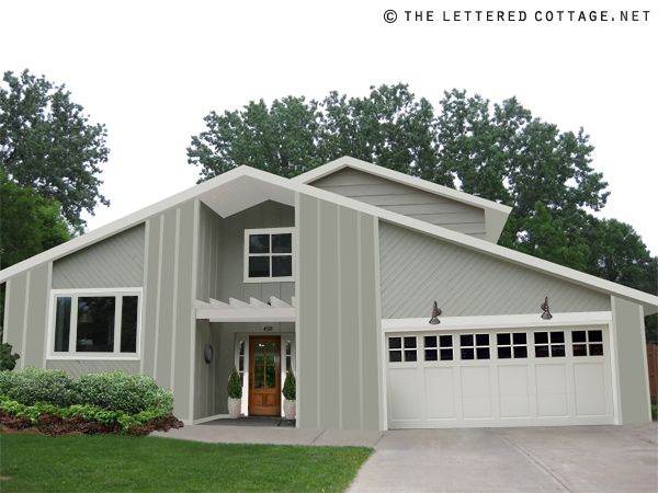
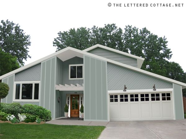
I stared at it for a few minutes and thought- “what if they added more board and batten in place of (or on top of?) all the stone parts? They’ve already some of it cladding the inset area around the front door, so maybe it would look alright on the front of the house too?” I put this drawing together to show them what that might kind of look like…
(Move your cursor on and off of the photo below)
(Here’s a still photo for those who aren’t able to view the interactive photo above)
(Note: My drawings are for inspirational purposes only, and the ideas shown in them are just that. Spontaneous, totally flexible, just-for-fun, ideas. And since this is a just-for-fun-photo-consultation, and not an actual-and-perfectly-to-scale-virtual-consultation, I have no idea if any of the ideas, colors or finishes I used in the drawings would actually work in real life. Boo ya.)
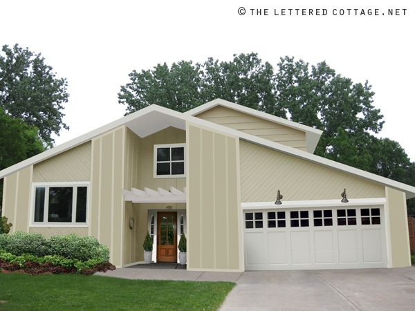
As you can see, I drew in some board and batten to cover the rock parts with the help of my friend Mr. Adobe Photoshop. White side lights and a warm wood front door make the entry area pop a little more, and a new (white) garage door with gooseneck sconces above it give that side of the facade a freshened-up feel. After I popped the garage door in, I drew inspiration from it’s 4-pane windows and added a couple little horizontal pieces of molding to the window above the front door. I like the way it ties those two areas together. And last but not least, I got rid of the little planter area cutting into the sidewalk, and snuck in a couple of big plant pots filled with flame-shaped evergreen topiaries on either side of the door. Again, just ideas. (Take ’em or leave ’em Jennifer!)

Then I got to thinking- “maybe they’d want to see a few more paint color options, just for fun”. So I put together a few different drawings for them to have a looksie at. First up, a light biscotti color…
(Move your cursor on and off of the photo below to see it switch from before to after)
(Here’s a still photo for those who aren’t able to view the interactive photo above)
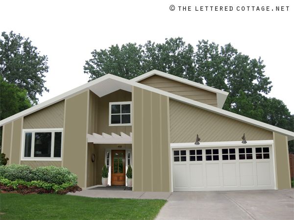
Then a dark beige…
(Move your cursor on and off of the photo below to see it switch from before to after)
(Here’s a still photo for those who aren’t able to view the interactive photo above)
Then a dusty blue…
(Move your cursor on and off of the photo below to see it switch from before to after)
(Here’s a still photo for those who aren’t able to view the interactive photo above)
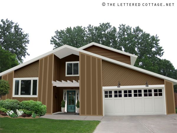
Then, just ’cause you never know what everyone is going to be drawn to, I pulled that color level thing-a-ma-jig in the opposite direction, and tried a warm brown, with a dark aqua-colored door…
(Move your cursor on and off of the photo below to see it switch from before to after)
(Here’s a still photo for those who aren’t able to view the interactive photo above)
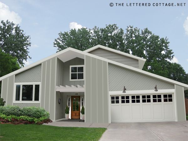
OR, maybe just keep it super simple and tone down the stones with some kind of stain or opaque paint (?), for this kind of a look…
My favorite’s the gray one with the board and batten siding…especially when it’s surrounded by a sky full’a blue…
(Move your cursor on and off of the photo below)
(Another still photo for those who aren’t able to view the interactive photo above)
Hope that gets those creative gears a’ turnin’ and thanks so much for the opportunity to pick your presto this week, Jennifer! I look forward to Photoshoppin’ another interior space sometime next week!

Wanna submit a photo for our Pick My Presto series?

Send an email to PickMyPresto [at] aol [dot] com titled, “PICK MY PRESTO- Living Room“. (Replace the words Living Room with whatever type of room you’re actually submitting.) In the body of the email, include your name, your blog name (if you have one) your design likes & dislikes, and one photo of the space in question. (No links please.) It should be clear, and measure at least 400 pixels high x 600 pixels wide. (In other words: at least 4″high x 6″ wide) The bigger the better! Make sure it’s a photo you’re comfortable with us showing and writing about on our blog. Then, whenever I’m feelin’ the urge, I’ll randomly select someone’s email and have a little fun creating some traditional or cottage style presto change-o inspiration. Oh, and since I love surprises, I probably won’t email you to let you know I’ve “picked your presto” unless I have a specific question for ya about your space.

——————————————————————————————————–
Join us on Twitter or Facebook!


————————————————————————————-
Need help arranging your furniture?
Check out my e-book!


hmmm…I like that biscotti color, myself! It’s difficult to work with that A-frame architecture, this looks really neat!
Keep the stone and tone it down with stain or paint.
Gorgeous! I love the garage door style. That makes a huge difference too. Nice work.
Love the dark beige b&b one the most! When I see pick my presto I get allllll excited. I know they are time consuming but you need to do more….many more (please). They are probably my fav design feature of any DIY blog that I read. I am not a person that can look at a before space and a mood board and visualize the final picture.
Oh, they should SOOOOO do that…in any of the bluish/greenish/goldish options 🙂
Wow. Love the changes you have here. What a big difference they make without a complete redo. I would love to have your recommendations on our living/dining room. It is a very used space in our home but it needs some major help. I need to get some good photos. I am so excited!!!!!!!!!1
Ruth
Oh, I love the ideas you gave, but the dusty blue is my favorite!! Have any actual paint color names of ones you like? I would love that for my own home. I’m tired of all the brown in my neighborhood.
This was fascinating. You ought to make this exterior thing a bi-weekly feature. What I liked was that they could paint the stone a little, then save up the money to paint the house and put on the cladding. You are really good at this!! AnnW
Totally cool. Would love to do this for my boring home. Would love to see what Jennifer chooses and the final product.
Very nice! I like the gray too. And Jennifer is right on: you guys= y’all or all y’all. It seems you have to explain this: my daughter once had an interview with two people in Mississippi and used the term “you guys,” and her interviewers burst out laughing. Who (in Minnesota) knew??? LOL
super fun! i love the gray!
Wow–I love, love, love the first Presto with the gray and white board & batten! Stunning and inspiring! Thank you for sharing it!
Love it-my only extra would be to maybe do the inset-that whole piece around the door-in the same color as the trim, and do the trim over the door a few shades deeper OR a complimentary color to the trim -just for fun 🙂
love love love! what a transformation! and something else… it seems like the two parts of the house are kinda separated. maybe a trellis could be built over the garages that extended to meet the one over the front door that had the same design as that one. it could tie it all together, the lights could be hung from those, and you could add some lovely little plants too 🙂
My fav’s the grey one too. The stone toned down with paint’s pretty nice too, especially considering it may be their only affordable option.
That may then be their best option, as they could get some visual relief immediately, and board n’ batten later on when the budget permits.
Well done, Lettered Cottage!
It’s amazing how fresh the house looks simply by updating the trim to white! I love both things you did, and I love the grey too. But if budget doesn’t allow them to cover the stone for now, they could always color the stone for now and do the board and batten at a later time when they have the $$. Awesome redo, Layla!
Wow!!! I absolutely love it. The grey and the darker beige are my faves. Love the front door you picked out, and that garage door too (especially with those lights!) Do you ever do follow-up Prestos, which show what the homeowners actually did? Would love to see the actual transformation!
I actually like the one with the stone that’s toned down. It lends texture without being so “in your face.” The others are nice, too, but lend a more contemporary feel. My favorite color is the gray, then the biscotti. I think an aqua door would look pretty with either of those, too.
I like the painted stone best!
what a transformation………………..love the gray tones 🙂
Another AMAZING edition of “Pick My Presto”, Layla! Gorgeous and budget friendly. I would love to hear what Jennifer likes best. We need to re-paint our cape-cod style house (the storms here in Kansas are hard on the paint!) and you have given me some ideas. I am leaning towards the biscotti color and white rim. My door is currently a fabulous barn red, but I like the warm wood color you used, I also like the soft sage green in your other post, and I like light blue for the door. I also have black shutters right now. What to do???? Love your site, you and Kevin are so gifted. I really look forward to your posts.
Wow, gorgeous! You are a guru, Layla. 🙂
I like the toned down version keeping the stone…the reason is due the architecture of the house the other options (although lovely and NOT a reflection of your taste Layla) comes across looking a bit like a fire station. (to me anyway). I think with the toned down version AND adding the topiaries at the front door (as in the other versions) as well a new entry door would be lovely. But then that’s one gals opinion.
Can’t wait to hear your design show news!! (would love to watch you and Kevin in action as your videos are always so entertaining AND informative)
love the grey color with the rocks painted over. What if u took out the thing above the porch, don’t know whats it called, and added flower boxes under the top window above door and also the front window? The wooden door looks great. The new garage door and the molding on the windows is great. But what do i know? nuttin honey. Lookin forward to ur post on your possible design gig.
I disagree with covering the stone up! That is a WONDERFUL feature. Definitely apply a stone wash and lighten the color, but DON’T cover it up!!!!!
Giving the entire house a wash of color to tone down the stonework is a stroke of genius! You aren’t changing the house into something it isn’t- you are just making what is there look a *whole* lot better! I love the texture of the stone, but not the color- and you fixed that- wonderful!
Looks great! That’s the exact garage door that I want when I update my exterior. SO pretty!!
I like the stained stone. with the different color front door and the new garage door. The Garage door that you picked out fits the entryway better. What bothers me about the design on the house is the siding going in all the different directions ever until you have the money to change some of that . The stained rock looks the best.
I LOVE ALL YOUR IDEAS! You have amazing vision. I just stumbled upon your blog this morning and needless to say I’m a new follower. Your before and after photos of yours and Kev’s home is AMAZING! Thanks for the inspiration….your blog rocks!! xoxo
Not that I count,……….but I think keeping the rock is a MUST and most of the extra cost covering it. I did like the gray. I think keeping in mind the natural rock and decorating around w/browns many be the least costly update!
Love your ideas for the redesign of house with faux stone – what a great idea
Wow, I looked at that before photo and was TOTALLY stumped! Guess that is why you are the designer:)
Great ideas!
Amazing!!!!!! The house looks so fresh and inviting with your design!! I hope they push thru with this look- any of the looks you made! great job guys!
Great idea on the siding… I really think the diagonal “old” siding that remains dates the house. I am thinking they should replace that with horizontal siding much like the dormer on the house. Also they could extend the pergola look out a bit and bring it out over the entry sidewalk??? Love the garage door and the lighter biege/ khaki paints you chose. I think the blues were so common to that period that it doesn’t look as new and fresh as the other colors! Another great job Layla!