Do you know Beckie? She blogs at Infarrantly Creative, Road Kill Rescue and Knock off Decor:


Well, she asked me if I’d be interested in throwing out some ideas for her fireplace one day and, well, you know what happens when people ask me for design advice. 😉
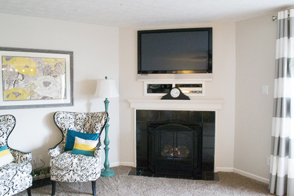
I started by staring at this photo of her fireplace for several minutes…
…then I rounded up a few inspiration photos I found online. After that, I played around with the photo of Beckie’s fireplace in Photoshop to give her a few different ideas of how the fireplaces in the inspiration photos might *sort of* look in her place. Here’s what I came up with:
Idea #1: Mega Molding
Since Beckie’s fireplace facade is flush with the wall it sits on, there’s not really an opportunity to do anything that sticks too far out from the wall unless they want to dive into a pretty elaborate construction project- which they do not. So, idea #1 was inspired by this photo:

Here’s what it looks like popped onto Beckie’s photo:
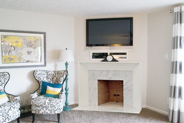
She wouldn’t necessarily have to use marble around the fire box…tile or stone would do the trick, too!
I also couldn’t resist popping in the gray wall color and dark hardwood flooring…just to see what that would kind of look like:
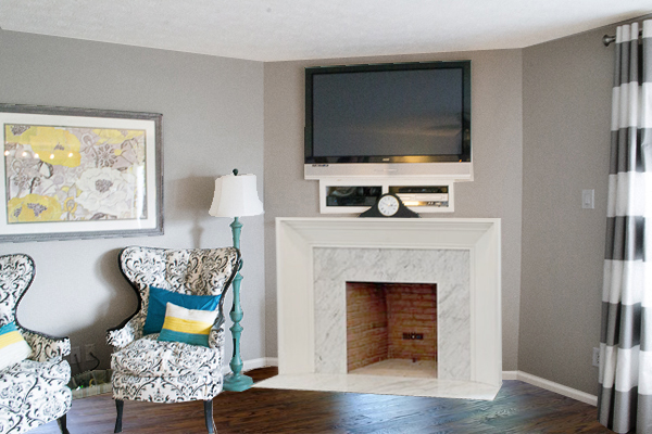
Pretty neat! 🙂
Idea #2: Color Contrast
Idea #2 was inspired by this photo:
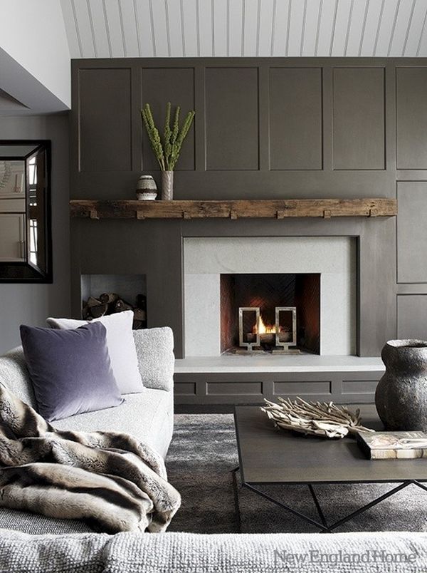
And again, this is a very rough virtual sketch, but I was thinking that she could cover the existing black tile around the fire box with some kind of faux concrete (like Skimstone, or Ardex), and then build up and trim out the rest of the space around the fireplace with molding and dark gray paint.

A chocolate-y brown, rustic wood mantel would be the perfect pièce de résistance!
Idea #3: Craftsman & Columns
My last photo drawing was inspired by this photo:

(Fireplace: Belzowski Homes Photo: Matt Cashore)
Here’s the (rough) photo I pasted together in Photoshop to show what a couple of angled columns and some craftsman-style molding might *sort of* look like:

Again, Beckie wouldn’t necessarily have to re-create that exact pattern with the molding (maybe lose the arched part for something cleaner lined?), and the sky is the limit when it comes to tile. I’m just hoping these photos will help get her super-creative gears turning, and that she’ll share her ‘Ta Da!” photos with us here with us when she’s done!
(Hint, hint Beckie!) 😉

PS- If you’d like to learn how to use Photoshop or Photoshop Elements to modify your room pics, click on the Shoot Fly Shoot banner below to check out our Room Makeover class!

You have a gift!
I LOVE LOVE LOVE the dark grey with the rustic mantle. GOR.GEOUS.
Great ideas, as always! <3
You are like the fairy godmother of room makeovers. Bibbidi, bobbidi, boo, and there is this magical transformation! Love the magic!
I like number 1 best. They are all nice (and you are so clever with photoshop) but to me that small space just needs a bit of the big ol’ molding! And yes, I “know” Beckie. She is a regular stop for me like you are 🙂 She is so dang crafty! I was brought to her from Sandra–Sawdust Girl and just recalled that in a comment to her the other day. Beckie could knock one of these out now that she has mad carpentry skills too!
You are a wizard with photoshop! I really like option #2.
I love opition 3. Can’t wait to see the final touch.
I like both #1 and #3–I also like the contrast with the light grey walls. Nice work.
You are a photo shopping ninja!! I’m totally in love with the craftsmen option. The curve at the top is unexpected, too, which adds some extra visual interest.
the big tv disappears with the dark trim.. my vote is #2
Nice Job!
I love the color contrast idea! So beautiful!
I love #2. The contrast with that nice wood mantel is gorgeous.
I like both options for different reasons…but the Craftsman style works better in that space (imo), and I love the bright white!
Great ideas! I follow her blog and look forward to seeing what she does. Hey, when are we going to see the ‘after’ of that great living room for the firefighter??!!
Thanks, Dawn! Hoping to finish and photograph Keith the Fireman’s room this month! 😀
I think they are all really great. However, I love the last one but without the columns, but the first one would be the fastest/easiest.
Great ideas! I’m personally liking #2 the best…I think the contrast works really well in the room.
Layla,
I want to plank the fireplace wall above the mantel but our fireplace is in the corner and the ceiling goes to a point up top. What would be the best way to plank this? Vertically and put molding around the edges? or just do some molding up and down spaced like 6 inches apart? I am torn. Please help.
Great ideas Layla. Boy do I have an odd one that has just left us unable to finish it for years. (blushing with embarrassment now). I’m just at a loss where to start. Knowing you it would be done in less than 24 hours. Thanks for all you share with us.
Hugs…Tracy @ Cotton Pickin Cute
I wonder which makeover your friend will do. I loved all the fireplaces you chose but looking at her chairs and fun lamp and drapes, I loved the last one best. How neat that you did this so she has the idea in mind before deciding. The wood slats of wood look great.
Who would even have imagined this 25 years ago?!!
For this house and the furniture, I vote #3!
I just did a dark grey fireplace on light grey walls!! I am in LOVE with it!! All of these look great!!
Layla, you won’t believe it, but that second version you came up with was in my daughter’s last apartment! Why do builders come up with those ridiculous odd corner fireplaces? They make little sense for furniture layout and space planning.
We pretty much ignored the fireplace in the room and arranged the furniture the best way possible for her. The room was TINY, and very awkward. If she wanted a fire she usually curled up on the floor in front of it anyway.
I really like the last of your choices Layla. For years we had a firplace in our different homes but not in our current home… and I miss not having one. If I had a fireplace I would want to consult you, you have, and find such great ideas!
Janet
The second one looks the best to me. I would also like to see the walls that dark gray, just to see what they look like. What are builders thinking when they invent these awkward layouts?
You-are-brilliant. I love seeing how you transform fireplaces. I like the dark wall with the rustic mantle best.
I love all the photo shoot creations! I enjoy all your posts and projects as well. You are oh-so creative with your designs!
Definitely No. 3! Any idea what you would do with our huge field stone fireplace? It’s the only thing that’s original in our Blue Cottage.
Love it, but it takes all my will power not to white wash it for a cleaner look. Everyone I tell about that thinks I’m crazy. I definitely want to top it off with a reclaimed wood mantel.
http://www.dagmarbleasdale.com/2013/09/fall-mantel-decor-at-the-blue-cottage/ Would LOVE your input!
I love#2 with the contrast and the way the darker color seems to camouflage the equipment. I would definitely let go of the clock–it seems to draw the eye to the distraction of the equipment. How about attaching some sort of screen/small door that matches the color, covers the equipment and still allows it to breathe?
Love following your blog and appreciate your creativity!