We’re up to our eyeballs in primer today, but since we had a few questions about why we decided to lighten our Gray Owl paint by 50%, and what it meant to lighten paint, I wanted to publish a quick post about that here today.
We decided to go with the 50% lightened version of Gray Owl because we like the way it looks and it seems to flow nicely with the Gray Lake-painted walls in our sunroom next door.
A commenter named Cami (Hi, Cami!) asked if we could post a photo of the lightened Gray Owl next to the regular Gray Owl, so here’s another shot of the current kitchen paint colors (Manchester Tan and Algonquin Tan), and the ones we’re switching to (Simply White and Gray Owl lightened by 50%) next to regular Gray Owl:
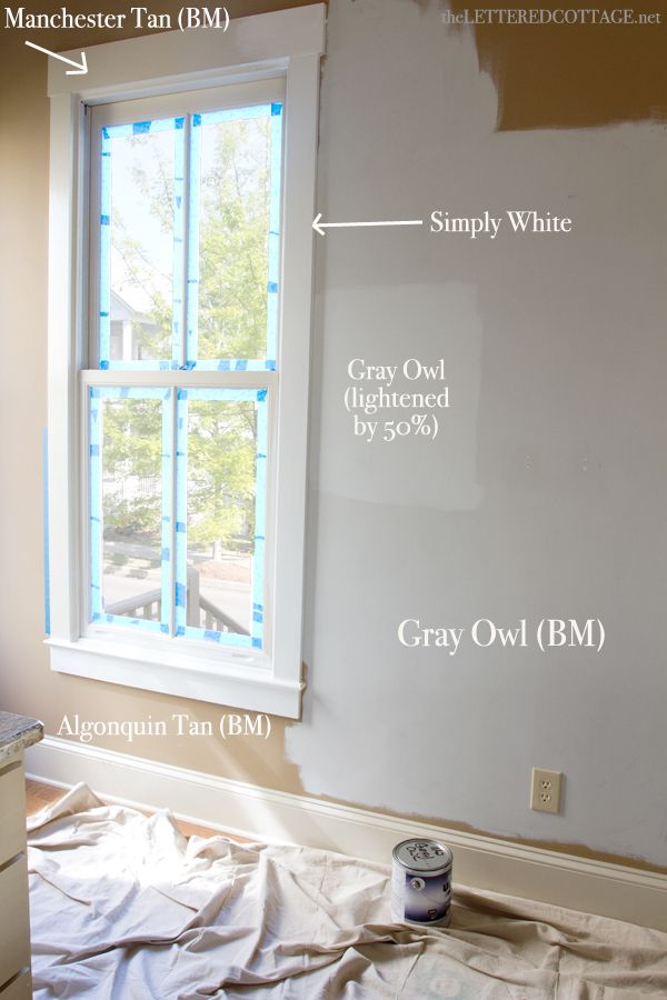
You can see the biggest difference in the new trim color up at the top of the window trim. We’ll be painting the baseboards, crown molding and doors Simply White as well. After that, we’ll swap out the off-white switches for bright white ones at some point, too. Ooh! And to the commenter named Sarah (Hi, Sarah!) who asked if we’ll be painting our kitchen cabinets- the answer is yep! We’re going Simply White on the uppers and lowers on the stove side of the room, and a shade of green on the island.
As for the paint lightening process, we asked a friendly fella at our local Benjamin Moore store to break it down for us and this is what he said. When you mix a paint color, you start out with a can of white base paint, and you drop a certain number of other colors into it. He gave us an example of a paint color being 10 drops of yellow, and 10 drops of black. To lighten any color by 50%, you would cut the number of drops in half. For example, you’d only mix 5 drops of yellow and 5 drops of black into the white base paint. You’d do just the opposite to make a paint color darker. Pretty cool, huh?
Here’s one more pic of the lightened version next to the regular strength version of Gray Owl:
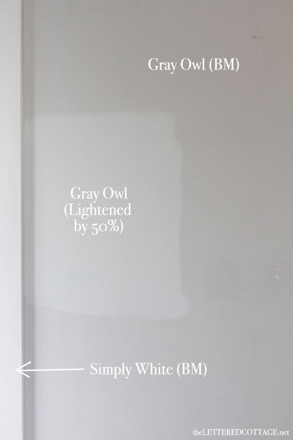
There’s not a *huge* difference, but it’s just the intensity of Gray Owl we were looking for, so we’re gonna roll with it! #literally

PS- For pics between posts, join us over on Twitter, Facebook and/or Instagram!


I am debating paint colors in our living room/dining/kitchen right now. Will be painting my cabinets this summer so I am trying not to jump the gun on the wall color before I know what color I will do the cabinets…I bet Gray Owl for the cabinets is exactly what I am looking for. Thanks!
I have a question. How did you know the name and brand of the paint that was already on the wall? Were the paint cans left there from the last owners or is there a nifty trick to figure this out. We need to touch up walls in our house we recently purchased but the paint cans are not here from the other owners.
Hi Amber! No one had ever lived in our home before we bought it, but the builder left a piece of paper in one of the kitchen drawers with the paint colors listed on it. 🙂
Thanks for the sharing the info. So cool!
Just the post I needed! I was wondering what the process is for darkening a paint color we like!
I’m famous at the BM store for lightening and darkening colors but I guess not all colors can be lightened. I used Amherst Gray (one of the dark historical colors) on a friends bathroom and wanted to lighten it to 25% for the trim and they told me it didn’t work like that. We had to pick a complementary light gray for the trim (which is incredibly hard).
I can’t imagine what they were thinking when they picked those other colors. What you’re doing is going to change the place dramatically!
I work at a Home Depot in the paint department. All colors can be lightened or darkened in one way or another. Who ever told you that it can’t, wasn’t very knowledgeable in their field. Paints are made into different Bases. Depending on manufacturer generally there are 3 or 4 different bases.White base for very light colors(also their white paint),pastel base for pastel colors, accent base for darker colors, and deep base for deep dark true colors (deep base by the way is basically clear paint.)
Some have just White, Medium, and Deep bases.
Now all bases except for deep have some amount of white tint in them.
White 75%, Pastel say 50%, Accent about 25%.
To lighten(depends on the color) either add more white or change the formula to a different base. Why does it depend on color? If there is no white in the formula, adding white may also gray out a color. I check then to see if the color, for instance, has any yellow then i add more of it, to lighten. now a darker color if made in a deep base will not get darker by removing a percentage of the colors.Instead you get more transparent paint. I therefore look to find which colorant is used to darken things up in the mix and add more.
I hope some of this info helps….
Hi. So another question with regards to lightening paint: why then wouldn’t you just select another color? There are so many to choose from. Thank you.
Sheryl
40something wife and mommy
Philadelphia, PA
Hi Sheryl! Out of so many grays to choose from, Gray Owl was the exact shade we were looking for…we just wanted a lighter version of it. 🙂
Thank you! (What happened to my fish? I hope you saw it.) 🙂
You’re welcome! (I didn’t see your fish!) 🙁
Ok. How about < now? 🙂
Wow, that looks fabulous! This is exactly what I was looking for when repainting our dining room. We just purchased our first house and move in this weekend. The downstairs is covered in wood paneling. Wood walls, hard wood floors, and wood trim! Ahhh! I am ready to get my paint on! 🙂 Thanks for the inspiration!
I LOVE it! We always think very similar and my whole home is now gray! I did Graphite by RH but I am ready to lighten things up a bit and I love this! 🙂 My cabinets are white, soapstone counters, and I LOVE the pop of white against a gray. ANY gray! 🙂 It will be gorgeous!
Layla,
Have you thought about contacting BM about naming this custom color “Lettered Cottage Gray”? That would be awesome!!
Thank you! Thank you! Thank you! I needed this post! I’ve been wondering about the whole lightening/darkening by 50% etc. I’m getting ready to paint just about every room in my house…& cabinets (yikes!)…& I’d already decided on Gray Lake for my family room, am now seriously considering Gray Owl for the rooms that connect to it! Even though the lightened version isn’t drastically different, just looking at a small section, I imagine a whole room in the lightened version would be a lot brighter than the untouched color. I definitely prefer the lighter version!
I heard you were in the paint store yesterday….how fun!!! You will love working with him. Did you see the Mimi shop I have there? My big store is in Orlando…stop in if you come to Micky town!
How different is the 50% diluted version from the lighter one on the paint chip – white wisp?
I’m not sure, Beth. I imagine that White Wisp is made up of a different color formula though, so it’s probably a different shade altogether.
Very helpful info an gorgeous, fresh colors! I have a quick question…could one lighten a color by just adding white paint (or darken by adding black) or is that going to create a mess? Keep those paint posts coming!
Well, adding white to anything will lighten it up, but since we wanted to stick to the exact shade of Gray Owl, we did it the way the paint store pro’s recommended. 🙂
Thank you Layla for showing me the difference between the grays. I love the 50% less and think I have FINALLY found the gray for our home.
Looking great! My husband and I are looking to perhaps purchase a foreclosed home. Can you give us any pointers? also how did you find your foreclosure?
Thanks, Paula! We have wanted to live in our current neighborhood for like seven years, so when we found out we could get approved for a home loan, we just asked the neighborhood real estate agent to show us all the foreclosures here. 🙂
Can you tell us what sheen you used on both the walls and trim paint? Thanks!!
Sure, Courtney! We went with semi-gloss for the trim and doors, and matte for the walls. We used to always use satin, but the guy at Benjamin Moore said their matte finish is just as durable and wouldn’t look as shiny on the walls. 🙂
Love this…I knew there was a formula as I too have had to darken/lighten but I just could not remember exactly how it went. Thank you for that valuable info!!! Can’t wait to see the final finish!!! LOVE this blog!
Hi, you are always inspiring me with you simple yet effective renovations ….. but I am patiently waiting to see the final result of your powder room next to the sun room ……
can we have a peek … pretty please ?????
gg
😀 We haven’t done anything in there since our last post, but we’re hoping to finish everything up next month! 🙂
Just a word of warning. Sometimes it doesn’t work out exactly right. I had a beautiful green that I had used in my kitchen and wanted to lighten it and use it in the dining room. I confidently got a gallon at 50% and when I painted it was way more yellow green than the original. I think in this instance using white to lighten would have worked better or else get a sample first.
Thank you for expanding on the 50% paint formula. I love making changes to my home, but when it comes to paint, I want to scream. So thank you…
Question! How do you darken a sample paint pot? Bought a nice green from Lowe’s. Right green but needs to be darker! Would adding a bit of black work? Or is that a bad idea? Any other ideas? Love, love, love your creativity! Thanks for any ideas you might have!!
MJ, does this help about getting it darker? I’d posted yesterday on Layla’s last post. But then she wrote this post! 😉 LOVE that Layla!!
Suzie says:
Apr 10, 2013 at 9:47 am
Here’s what it means for a paint store to custom mix a percentage of the original formula.
The color at full strength is 100%, so the 50% lighter custom mix is made using half of the exact colorants used to mix the full-strength formula.
For example: Let’s say a particular white uses 4 parts Raw Umber and 2 parts Gold in the formula. If you request 50% lighter, then the store will only use 2 parts Raw Umber and 1 part Gold colorants to mix in the can of base paint, and WAHLAH….a 50% lighter version.
If you request a particular color in 50% darker, then the store will ADD 50% MORE colorants in the same ratio, making your new custom color actually 150% of the original color.
Does this make sense or help anyone? I hope so:)
This is one of those little $3.00 sample pots. I was thinking Lowes wouldn’t want to add more pigment to something so small. (Plus it’s another trip!) So I was wondering if I could do something at home! Sounds like I just need to get in the car!
It can be changed sample or any other size, I’m sure Lowes will do it.
we will change our paints at Home Depot. Also tinting is free.
(I know this post is old I’m commenting for future readers..)
I actually think it makes a big difference and I really love your lightened version. Thanks for giving a side by side comparison. I think I’ll be looking for some new paint next month 🙂
Layla, I’m lovin’ the lightened version and I’m thinking of stealing the color for our guest bedroom/one-day-future nursery. How awesome would it be with light pink or baby blue accents! I can’t wait to see your finished room.
Thanks so much for posting this – I was wondering about how the two shades of Gray Owl looked together, too!
I am planning to paint my kitchen cabinets white and would love to do a green island also. What is the name of the green you are using? I’d love some inspiration. Thanks!!
We haven’t decided on one yet, Kelly- but we’ll let ya know as soon as we do! 🙂
love the Gray Owl in the 50% lighter, great choice!
too funny … our kitchen is simply white, and our island is a “shade of green” – camouflage. hindsight: all the white overpowers the camo and it’s too pale. should have gone a darker shade. we were hoping for “army green” and it turned out more sage. bummer. can’t wait to see how yours turns out – the gray owl is beautiful!
Love that color! Now I trying to find a room that needs it! Lol! I love everything about your style! Makes me want to visit, enjoy the beauty and pick your brain!
Thanks for explaining this. I figured that’s what it was but this explanation broke it down real simple. I think these lighter colors are going to look great in your house!
Layla,
I was seriously about to email you on this very issue! I’m painting our piano room, the walls are currently Believable Buff by Sherwin Williams, I want to make them a light gray so I bought a sample of owl gray since you mentioned it. It looks more blue than gray, any suggestions or another color come to mind?
Thank you!!!
Hi Miss Layla!
I was wondering if you could give a tutorial on painting windows. Especially, about the lovely double-hung one in the picture. I have a lot of double-hung windows that need painting, but they also need to be able to open when I’m done. If you have any tips or trick that makes the process easier, it would be greatly appreciated. Thanks!
Sarah M.
I’m wondering what the difference is between lightening (or darkening) a color by 50% instead of just going a shade up (or down) on the color strip.
Thanks for your blog. I really enjoy it.
Here’s a really good post I came across a few years ago on how paint chips and and fan decks are put together. It explains why going up or down on the strip won’t always work. 🙂
http://www.mariakillam.com/what-everyone-should-know-about-fan-decks/
I should have read the comments before I asked the question. I see you have already answered it. Thanks.
PERFECT timing on this post! I am just about ready to commit to a paint color for our downstairs bathroom – but was toying around with the idea of lightening. It is so great to see a before and after to compare it, and get an idea of what that means, and looks like.
great color Layla! We are fixing up a foreclosure as well – ours came with a *gorgeous* (read totally gross) hot tub on the sun porch. fun stuff.
anyway – wanted to let your readers know of another great color very similar to gray owl – same tones just a smidge lighter – sherwin williams conservative gray. I’m using it throughout our house with trim color BM white dove. Hopefully it will look good!
Can’t wait to see more of your gorgeous home!
Thanks for the education. The 50% lighter Grey Owl looks cleaner next to the full version. Looks like you washed the wall there. I think it looks brighter too. It’ll look great when you are done.
Love your blog and adore your style sense!
Thanks so much for this info. A friend was telling me about the whole 50% lighter business, but I couldn’t picture what it would look like. I may just have to try this with some upcoming painting at our house.
love the gray owl are you going to prime your walls first
Looove gray owl 🙂 So much that we decided to paint our entire downstairs BM Gray Owl without getting a sample on the wall first (dumb, I know).
It turned out super blue!!! Did that happen with yours? I think a lot of it has to do with the lighting (or maybe because while we thought the trim was white, it’s really off white). It’s still a pretty color, just far more blue looking than gray looking (and I was super pumped about gray walls).
Hi Maureen!
Yes, ours is leaning blue too- which is actually why we chose it! 🙂 I look forward to blogging about it later this week!
Layla
Thanks for showing the difference in lighting paint.
I have bought several gray paint samples….Going crazy here. Can’t find one that I like….
Does Gray Owl look more like a “baby Blue” gray?
Trying to find a gray with a very slight blue tone, not purple, green…
Do you have any “after” pics to show?
Hi Layla! Well, this is the weekend. I’m going to paint our small bathroom. All fixtures and tile are white and I want to paint it gray. I’ve been following all your posts about Gray Owl so think I’m going to go with your recommendation. Here’s my question for you: the bathroom does not have a window. I don’t want the color to look washed out or too dark. Do you think going with the lightened G.O. would be good or do you think I should go full strength? I know this is a hard question to answer but I would love your gut feel opinion! Thanks, Mitzi
Hi Mitzi!
Every paint color looks different in every room, so my advice is always to buy three or four samples pots of paint so that you can paint BIG squares of each on your walls and live with them for at least 24 hours. That’s the only way to really know if a color will work! 😀
Thank you! I spent the day painting both Gray Owl and Cliffside Gray. They are very similar but the Owl has a brightness I liked. Will finish the job tomorrow 🙂
can you show me how to darken the paint. I have a benjaming moore Grant Beige that I’m using for my walls. I want to use the same color but darkened for the trim.
How do I darken the Grant Beige.
Hi Barbara!
You’d have to talk to the folks at Benjamin Moore about darkening the formula when they mix it. Happy painting! 🙂
After reading this blog post I had my paint store mix a half-formula gallon of BM Edgecomb Gray. It turned out great!
The small bedroom I needed to paint did not have as much light as another part of the house painted Edgecomb Gray. The half-formual version brightened it up just a bit without compromising the color.
Thank you for this. 🙂 I am sorry I didn’t notice the option to click. This mama was covered in wigggly toddler love while reading your blog so thank you for being gracious. <3
I love this because I’m having the worst time trying to pick a paint color for all our living spaces. We have an open floor plan, so everything has to flow. I have samples of BM Camouflage and Hazy Skies and while I like both, the intensity of each is a bit much. I may see if a BM store will make a sample of each of those at half strength and I can see if those will work. This blog post was incredibly timely for me! 🙂
Hi Layla,
Are the walls in your home textured or smooth? Mine are all textured (orange peel looking) and wondering if yours look so much MORE spectacular if they’re on a “smooth” wall. Besides that, everything you do looks SPECTACULAR!! 🙂
Cynthia (in California)
Ours our smooth, Cynthia. Thank you for the kind comment! 😀