Happy New Year!!
I’m ready to tackle some more home projects this month, and I’ve got a fireplace paint color question for you today. Right now, the backdrop of ours is a custom-mixed color I call “Blue Yonder“…
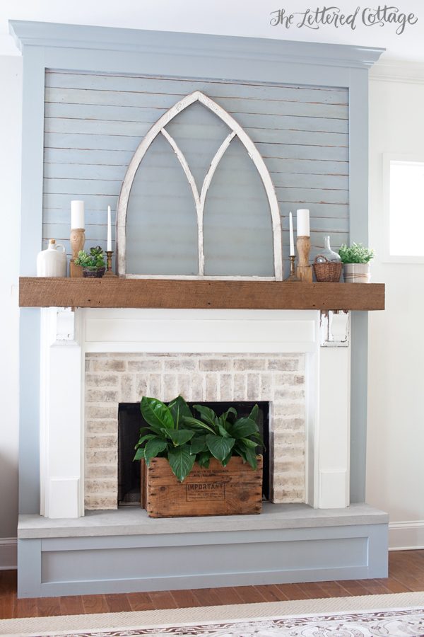
(PS- the church window is a dark, natural wood on the flip side)
But here’s the thing: we painted it that color because the antique horizontal boards (on the upper part) were already painted that color. We just took one of them to the paint store and had it color matched. But do I really want it to be that color all the time? I’m still not sure. When Kevin got done painting it a few months ago, I told myself I’d live with it for a while and decide in 2016.
Oh! Well looky here! The calendar says it’s 2016! 😉
My spirit color is normally white when it comes to wood-backdropped fireplaces (spirit colors can be a thing, right?), and I do love the idea of not being locked into a color all the time. But then again, I do like the color, and the challenge of working with it, so, hmmmm.
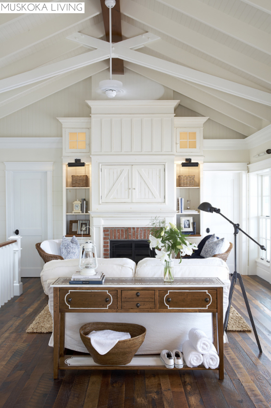
On the other hand, I also like the idea of the future built-ins being the same color as the fireplace…like these:


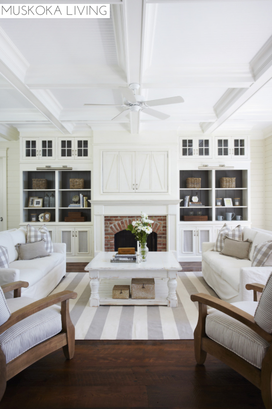
…and this:
So. What do you think? To repaint, or not to repaint…that is the (current) question. Let’s #PutAPollOnIt :
Thanks, y’all!


I love the Blue Yonder and would leave it only on the trim around the fireplace. I would paint the ship lap white giving you a blank canvas to decorate but still show some of your lovely blue color as well.
You have to live with it. It is your space. You gave the blue yonder a go and ….it really sounds like you want the white. I think you should go with your gut. Either way I am sure it would be beautiful.
What about leaving the horizontal boards in the Blue Yonder and then white for the rest of it? If you did built-ins on both sides, you could still do them white and they could blend with the fireplace more. You could even pick up the blue in the back of the built-ins if it isn’t too overwhelming.
Exactly what I thought.
I’m not a two-tone girl. It’s gotta be one or the other for me! 😀
I know you’re not a two tone girl, but it wouldnt be distracting, it would be more interesting. I love the blue inset idea.
I think “interesting” boils down to personal preference. You *see* po-ta-to, I *see* pot-tah-to kind of a thing. 😉
Layla, I came across four or five posts of yours that just woud not load after waiting the longest time. I’ve not had that problem with any other blogs on Bloglovin’, and I don’t know whether there is anything you can do about it or not. But I enjoy your blog and hope to continue receiving it.
Thanks for the heads up, Gail! I haven’t had that problem on my Bloglovin’, nor have I heard from any other readers about it, so I’m wondering if it has to do with your internet connection? Let me know if it continues to give you trouble and I’ll ask around for help! XO
I do have a problem viewing your blog on bloglovin. I usually have to go straight to your page. No problems with other blogs.
I also have had trouble with Bloglovin, it stopped loading new posts from you, but not any other blog I follow. I had to unsubscribe and have just now, a month or so later resubscribed. We’ll see how it goes…
Thanks for the heads up, Sandy! Yes, I had to reach out to Bloglovin’ a few weeks ago, and as far as I know the issue has been fixed. I didn’t realize some folks would have to re-subscribe though! :-O My posts didn’t show in my Bloglovin’ feed for about a month before I noticed it, but once they reset things, they all popped up for me.
I love the blue. It has a vintage country feel to it. If it was my room, I’d leave it blue and paint the side book cases white.
I agree 100% with what Jenny says – she took the words right out of my mouth! Love all you do Layla…
Ditto! Everybody has white…………….. I love yours because not only is it lovely, it’s not the same ol’ same ol’………………..
I agree! Yours stands out in a sea of white. I love this way it looks right now.
I know this poll is over, but I so agree with this. Everyone has white (which I personally love, too), but this makes your room exclusively yours. And I love the blue color, too.
I like the fireplace and the texture you added with the ship lap and windows. I am attracted to the same type of inspirational photos so I like white as well. Is this a working fireplace, or is this a fireplace mantle that you have added to the room? I like the color you chose but I do prefer white as you have lots of texture with the brick and ship lap.
It’s a working fireplace, Dorothy. Here’s a link to the before and after post:
https://theletteredcottage.net/fireplace-makeover-reveal/
🙂
You have to decide on a color scheme for the whole room and if it goes with the rest of the house. Then decide because you are limiting yourself for the future.
The color scheme will stay the same no matter what, Lisa. White, off-white, cream, beige, black, grey and pops of blue and green! 😀
I guess it really comes down to—do you want the fireplace to stand out in the room or be part of the “wall”? Keeping it “Blue Yonder” lets the fireplace and its surround be the focal point of your living room. Moving to white allows the furniture and the wall of “pictures” be the focal point.
There is your dilemma: what is the focal point?
Hmmm…good question, Kate! I guess I want the fireplace *wall* to be the focal point…not the fireplace itself. 🙂
In every example there is white or an off white but beyond it is a blue behind barn doors, or beyond the Windows ( wrap around porch?) or the shelves were dark a blue cast of gray with a blue cast on inner part of lower doors below bookcases or the light produced a vivid yellow glow. So I’m feeling like you maybe are tired of the blue? You didn’t even choose the color. It’s worked. But you want built ins on either side. To thine own self be true but it sounds like you’d like continuity across the project to appear as one continuous project. So if you put in the bookcases and put up some scrap book or wrapping paper in a similar color to get a feel for all that blue–would it excite you?? Use some butcher paper or back of wrapping paper and cover the blue. Pencil in lines too for the planks. Use computer paper on the bookcases. Do you like it all white? It lets you look back. Let your eyes rest on it a bit. And know in your heart of hearts what is you.
I vote for white especially with the church window being dark on the other side. I also would cover the hearth with brick matching the existing brick around the fireplace opening. The blue yonder locks you in with color. Although there are so many accent colors you could use with it such as pomegranate red, mustard, green, pink, merlot, and
orange.
In my opinion working around a color that your just not sure of gets a bit frustrating. Although I LOVE the Blue Yonder color myself, I can see where you are coming from in terms of design so I say PAINT IT WHITE!!
But, why did you go with vintage wood to begin with then? Paint will cover the vintage-ness you sought. Why does your space have to be like all the others? Is it really greener on the other side of the fence? Your house is lovely. You model joy. Rest in it. There is a lot to be said for contentment…..
Great question, Sarah! We went with it because we thought the boards looked kinda cool at Southern Accents. Turns out, they’re a little more blue than we thought they were, and like I mentioned in the post, I’m still more drawn to and content with white-backdropped fireplaces. 🙂
I really LOVE the blue yonder . . . But then I look at the other “samples” you posted and I think the white will give you more options overall . . . Who am I kidding, you’ll make THE best choice! XO
I love a splash of color . Color is the easiest thing to change .
I would start looking for a color that you haven’t thought of . For me I know it when I see it , I think you will also .
Enjoy exploring the possibilities.
I love the blue yonder and think the white examples, though clean and fresh, are cold and lifeless. I am certain whatever you choose will be outstanding. Your choices are ALWAYS outstanding.
I vote for white. All of the rooms you featured have some color and texture that adds warmth and interest. As others have said, you do fabulous design so what ever you do will be beautiful.
Congrats to Auburn on the bowl win and ROLL TIDE.
The all white look can be boring and a little stark. You have a lovely serene feel here, which I love. If you’re brainstorming…..since this is where you spend your family time, what if you went for I love the soft neutrals that you have in your brick and rug. Have you considered that? You could try it out by hanging a piece of fabric up to see if you “feel it.” Can’t wait to see what you decide.
I like the continuity of the white as you add cabinets and the open palette it provides. It gives you lots of versatility throughout the year as you change out mantle decorations. And I’m a sucker for that clean, white look. But why not wait until you build the cabinets/shelving and see what you think?
‘Cause I’m too antsy to wait, and I’ve been thinking about painting them since the day the Blue Yonder went up- LOL. 😀
Based on all of your comments, I think in your heart of hearts that you really want white and that you should paint it. I myself am more of a colour kinda gal, but it is your home and experimental playground. Do what makes your heart sing. Can’t wait to see the progress.
I love both options so no help there, sorry. Whatever you touch turns out great.
Can you paint the built ins white and just live with it that way to see if you like it?
You could always paint over the blue if you didn’t like it with the white.
I think you could paint the FRAME white, as a start – that way, it will match the built-ins, but not be completely white (but, you can change that later, if you decide to). With the frame white, it becomes even more of a focal point, & highlights whatever you put up there. Just a thought!
I wouldn’t be surprised to learn that it has already been painted white.
White would look amazing! The fireplace would look larger too.
Oh, I’m so glad you asked! I’ve been wanting you to paint that blue ever since it went up. Not because I hate it….I always love everything you do….and I trust you and your eye…..but because I remember the 80’s when everyone had “dusty” blue everything, and I recall it with no nostalgia. So my vote is totally and completely, no holds barred white. I’ll be so happy with it. And I hope you’ll love it too! Happy New year, sweet friend I haven’t met yet.
Really love your blog and particularly loved the many different ways you decorated your mantle for Christmas. I love many colors and love to frequently change the way my home looks by changing accent colors. I basically stick to neutrals(whites, creams, soft gray etc) for the background and large pieces of furniture. Also I use the same neutrals for sheets, blankets, quilts and spreads. Then I can change the looks often by using pillow shams, pillow cases, throws and many wonderful thrift store or yard sale finds. If it were me I would opt for white all over the mantle. Still I love this gray blue. What if you could build a large wooden plank square the could fit inside the trim above the mantle. Make it so that both sides were finished. Perhaps one in this blue gray and one in a true gray. That way you could have an all white option, a white with blue gray option and a white with gray option. Many different looks! Oh and when the mantle is all white without the insert of blue gray on one side and gray on the other. You could use the insert to lean against a wall on top of a table or dresser to add texture to a vignette. Or how about out on your porch?!
Maybe just paint the very bottom part (the base) white and leave the rest as it is. I feel like that would help it make more sense somehow.
I love the blue but once you put in built-ins and add decorating stuff it might look a little busy. White will allow you to add more colorful stuff. Besides, it sounds like you felt the blue just wasn’t right when you got it up there and it’s still bothering you. Have you tried Photoshopping the room with it painted white? You do such a good job with PS. By the way, I love how the edges of the vintage boards are worn; it really makes them stand out.
I’d paint it all white. I’m not crazy about the blue. I love that color. Just not for that spot.
So, paint it white and see how you like it. You can always go back to the blue.
Either ways, white or blue yonder… they will both look good because you have an eye for interior designing. Follow what your heart tells you.
I know you’ve already made your decision, but maybe before you go fill steam, you try whitewashing it to lighten it up, while still keeping a hint of the color. Then if you still don’t love it, give it a solid coat.
It’s something to think about, and may save a little regret.
Karen U
You’ve got to be happy, so paint it whatever you want. You showed some lovely pictures, but after a while they all looked like the same room. White is lovely, but boring! You have too much style to be ho hum. Dare to be different. Besides, it’s not tile, it’s only paint which you could redo often.
I guess I’ll have to dare to be different with my art and accessories, Bernie- we’re almost finished painting it white! 😀 And like you said, it’s only paint!
Now THAT is a very difficult question ….. I love them both!! Maybe wait until you get the built- ins completed to decide?
I know you’ve already painted the white and it will look great that way, but I have to say that I LOVE the blue and your post inspired me to paint my white mantle in ASCP Duck Egg! I love it and can’t quit staring at it! So, thanks for painting yours blue for a little while 😉