Happy New Year!!
I’m ready to tackle some more home projects this month, and I’ve got a fireplace paint color question for you today. Right now, the backdrop of ours is a custom-mixed color I call “Blue Yonder“…
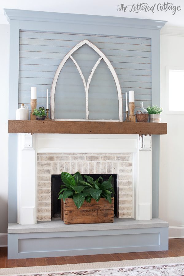
(PS- the church window is a dark, natural wood on the flip side)
But here’s the thing: we painted it that color because the antique horizontal boards (on the upper part) were already painted that color. We just took one of them to the paint store and had it color matched. But do I really want it to be that color all the time? I’m still not sure. When Kevin got done painting it a few months ago, I told myself I’d live with it for a while and decide in 2016.
Oh! Well looky here! The calendar says it’s 2016! 😉
My spirit color is normally white when it comes to wood-backdropped fireplaces (spirit colors can be a thing, right?), and I do love the idea of not being locked into a color all the time. But then again, I do like the color, and the challenge of working with it, so, hmmmm.
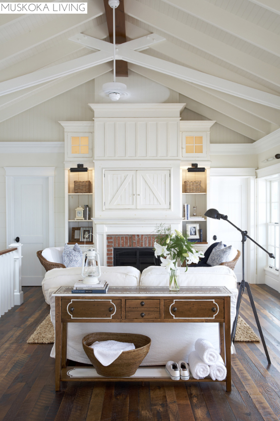
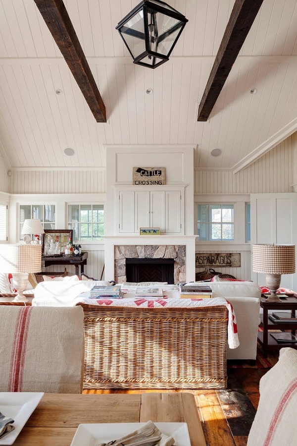
On the other hand, I also like the idea of the future built-ins being the same color as the fireplace…like these:


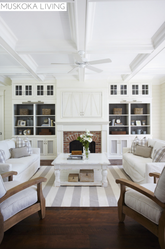
…and this:
So. What do you think? To repaint, or not to repaint…that is the (current) question. Let’s #PutAPollOnIt :
Thanks, y’all!


Can I chicken out and say ‘I don’t know’?
I really like the blue but I totally get it about white woodwork and being restricted by a colour, but I do like it as it is!
I like the blue yonder but maybe if you left the ship lap blue and did the rest white.
I completely agree with this. Let the ship lap be featured, and let the rest of the fireplace woodwork be a frame.
I love the blue yonder, partly because it’s unique. The white looks nice, too, but not nearly as “you” or as original. I’ve finally learned that while *I* might get tired of something I once loved in our house, my friends and family who are here only occasionally will love it and not grow tired of it for much longer. Yes, I want my house to please ME and my hubby every day, but I’m naturally going to get tired of things quicker than others who enjoy my house.
Also, I think the blue yonder is very neutral and could be changed up with almost ANY other color or combination of colors.
I completely agree with this.
ME too Me too – I agree completely. White is always pretty but it is EVERYwhere and is so ordinary at this point. Your fireplace is unique and the color is fabulous.
I totally agree with the others on this one. While I like the samples you showed, I love the blue because it is unique to your home.
I agree. The blue is so unique and so you. I love it!
I think all white has been overdone.
and the blue adds a softness that is
so often lacking.
Happy New Year, Layla and Kevin: I like the present color; it is not what everyone else has. Also, I think the blue is a neutral and most colors will go with it. I am looking outside; the sky is several shades of blue, there is snow, pine and birch trees and it all goes together nicely.
Hi Layla
I love the Blue Yonder, I seem these days to be in to the greys and blues…but sometimes, even when I love the blues, they make me think of baby blue and it’s a put off of a colour I love..crazy eh? I think I would paint it all white and distress just the face boards so that the blue shows through. Not a deep distress..just enough to give you some contrast and provide a little bit of interest.
That being said, I like it either way and you can’t go wrong with the colours you’ve picked no matter what you use, but keeping some blue would give it some depth.
Happy New Year and praying that your little guy will be home with you and Kevin soon..
I love the blue yonder. It’s soft and really makes the fireplace stand out. All white is nice but it’s something that just about everyone is doing.
I like it blue and that if you painted it white you would lose the pretty mantel surround. but I think you need to wait (sorry) until you do the built-ins to get a feel for what it will really look like.
I love the clean look of the all white photos. Add accessories for contrast. You can always go back to the blue!
PS. I’m not normally a white wall person.
All the samples you chose were white. You could’ve selected all sorts of other colors while considering it but you didn’t. That tells me you should go with the white…it’s there in your heart already.
Paint it white to match (future) built-ins on either side, but paint the back of the built-ins the Blue Yonder color (like Muskoka’s built-ins with the dark back). Then you get the pretty blue color in the room, but it’s more subtle. You can’t go wrong though – it sure looks pretty as it is right now!
Dear Layla, Blue yonder boards found their way into your home. They are unexpected, but precious and unique. When I saw the original post I thought instantly of your little boy finding his way to you. One of the things I really cherish is your ability to reveal light and beauty in what is. I wish your family the happiest 2016. Thank you for sharing your journey.
I would love to see it all white. The clean, bright feel of a neutral white background will make the whole room feel a bit larger and brighter. That being said, it is just paint and if you hate it, you can always go back to the blue or try something new.
Happy New Year, Layla! It is going to be an exciting one!
Hi! would you consider giving us a wider shot so we can see the fireplace in the context of the whole room?
The blue may be perfect – maybe not. But I cannot tell without the “whole picture”.
Sure love your style!
I love the different shades of white ….awesome!
White. While I love the blue I am really white sighted if that means anything. The blue shortens the room to me. I would turn the church window around to the wood. Have to say I love everything you do and the spirit you do it with. Blessings. Denise
I like the blue, ha, but white would also work! What if u left it blue and did the built ins in white with blue background?
I agree with the majority of the commenters! Keep it Blue Yonder – it is a neutral with gray undertones that will not limit you. The specialness of matching the original boards is what brings meaning/fun into making a unique home/haven. Even if white wins out in the poll, make note that response is from a majority and may represent less uniqueness 😉
Thank you, MB! I have to say though, that not only is he white is winning by a LARGE margin in the poll, it’s still winning in my heart after all these months of dreaming about it too! 😀 XO
I like the blue and I like the way the wood shows through a little on this old boards, but what about just painting the bottom of the hearth white?
If you like the blue/gray why not keep it that way until you really grow tired of it? By the time you get the built in’s done you might be ready for a change and then you can give the whole thing a nice clean new paint job.
I love your Blue Yonder blue. Any chance you could give us the paint formula ?
Thanks, Debbie Kingham
Sure! Here’s a link to the post about it, Debbie!
https://theletteredcottage.net/fireplace-makeover-update-paint/
Layla- part of why I love following you so much is because you do what you love & it is beautiful everytime. You chose those beautiful old planks because they spoke to you. Anyone can do white anytime & you can too, but the uniqueness of what you have already done is beautiful. Please leave it this way. At least until 2017… Wink
Katie Kreamer
I agree with the other commenters that the blue is more unique, BUT I really love the white. I’ve honestly never been a huge fan of the blue, although it does look good. It’s just not my color. So if it were me, I’d go with white. Good luck!
I love the blue! I think gray would look nice also. I really like how the fireplace is a focal point, and I think if it were white, it would blend in more. Plus, I feel like the blue is a happy neutral color, and really fits with the colors you usually use in your home. I love how it blends with the blues and greens you have in your kitchen. That said, I know whatever you decide will look beautiful! 🙂
Keep the horizontal boards Blue Yonder and paint the trim and other built ins white. :0
What if you started by painting everything white except for the original blue boards… I know others have echoed this thought. Then you could have white built ins, and if you didn’t like it you could paint the original boards, or go back to the blue? I do like it as is though. The wood above our fireplace is white and I love it 😉 It works so well with any colors, I just stuck a shutter up there painted in MMS Shutter Grey and I love it! But I have also accented with greens,yellows, blues neutrals… Those Muskoka Fireplaces are some of my favorites, I saved a magazine spread in Canadian House and Home from Several Years ago of theirs, and still love it.
I love the blue and you can’t go wrong with white…grey is also a wonderful option!
However you HAVE to go with what makes you the happiest because you will be living with it every day ? AND its paint…one of the easiest decorating choices to change!
Love all 3 options!!!
Stay with the blue! It’s wonderfully “different”/unique; there’s waaay too much all white or almost all gray out there these days. The blue is visually cooling in our HOT summer days, pleasing with the color of Southern winter skies, and a wonderful “ode” to “haint blue” ceilings which are used often in the South – and in the Caribbean (thinking of your Sweet P).
Elaine
White! It’s classic!
Opps! Me again. I meant to say “porch ceilings” when I wrote about “haint blue ceilings” above. Happy New Year!
Going white would give you more options when you accessorize the mantel and room in general. Boy I love the sample photo where their built ins had the glass doors in the top section! What if you used your blue on the back of the shelves like they used the dark gray? Gives you that gorgeous color but more as an accent vs a main feature of the room? Just a thought!
Agree that white and grey are everywhere and many houses, particularly on blogs, are looking much the same so nice to be original. The blue is lovely especially if it ties in with other items in the room. Not keen on distressed myself as I prefer a crisper look but appreciate it is very popular. Good luck choosing with so much advice! Happy New year from London.
Im thinking light grey ( or a very lighy rustic white with sneaks of blue showinng thru) for the tongue and groove boards and everything else white!
I love the blue, but I would def do the built-ins white, so I think the fire place trim should be white too.
To clarify, I would absolutely keep the old boards blue, but paint the frame/trim white.
Happy New year. I am not sure my comment will be helpful. But here it is. Why not live with it the way it is if you like it then when you put the built ins in you can change it to white. I mean why change it now for the one day in the future built ins. By then you may really be ready for the change to white.
It looks like I’m the minority here, but I say paint it white! 🙂 Happy New Year!
I think I would leave the shiplap blue (it’s a beautiful color!!) and paint the hearth box (not sure if that’s a word) and the other trim white. It would look so crisp against the distressed blue and tie in with the crisp white you already have on the trim around the fireplace box (also not sure if that’s a word!) 🙂 And also be perfect once the built-ins are there. Plus I just love the contrast of white trim against a wood floor!
Whatever you decide I know it will be beautiful! I love your style so much!!
*Change subject* I’m so thrilled with God’s working in your lives and your little Sweet P! Can’t wait to see his precious (full) face in your arms forever! <3 I'm praying that day comes VERY soon but trusting in God's perfect timing!
In the pics you posted all the fireplaces seem to disappear because everything is white so if thats the look your going for than white it is. But your blue stands out and says look at me.
PS: If you do white and don’t love it you can always change it back to the blue 🙂
For you, white. I will love seeing what you do with it as you change it up over and over. Because that’s what you do! For me, I’d stick with blue because it looks interesting, intentional, and DONE. (Did I mention I have four little boys, the oldest is 5?) Can’t go wrong, but you should do white.
Leave it blue! It so unique. Paint the built-ins white but leave the fireplace blue. It is the focal point!
What I always say is, flip a coin, and then take note of which side your heart hopes it falls on while it’s in the air. That’s how you know. No one’s opinion can make your heart happy! I think if you’ve been fighting the urge for this long, you must scratch the itch! Haha!
Since you’d barely finished the fireplace before it was time to decorate for the holidays, I’d leave it for a while and live with it sans holiday decorations, and see how you feel about it. You’ll know what you want by the time the built-ins are added and ready for paint. Everything you do is so lovely, so I know whatever you choose will be great!
I say keep it this way and enjoy the pretty blue, it is unique and every one tends to do white. When you build your built-ins, then consider white to give it unity. Happy New year! karen…
Love it the way it is. I agree with the others on the uniqueness of the Blue Yonder. Paint the built ins white. Leave The fireplace blue. So lovely!
I love both the blue and the white options. The fact that you are still second guessing it makes me think you’d prefer it white. I agree with other commenters that suggested leaving just the shiplap blue particularly since it is old, original paint with more color variation and character. You could leave the shiplap as is, and paint the surround white and live with it for awhile. If it still isn’t what you want, you can always paint the shiplap too, but I’d do it in stages until you’re sure since you can’t get that patina back. Any choice will be gorgeous so don’t fret too much! Oh, and if you ever decided to paint a board with a red and white barn quilt design as a mantel accessory, it would look great contrasted against the blue planks! They almost act like a mat in a frame for whatever decor you have. 😉 Happy New Year!
I love the Blue Yonder! Your Christmas mantle ideas all played so well off of it. It doesn’t look like everyone else…so original!!! How about painting the outside part of the built-ins white & the inside part Blue Yonder!!??!!?? I think that would be an unexpected surprise!!! No matter what you decide, you’ll make it look beautiful as always!!!
I love what someone else suggested.. paint it white and maybe distress so the old boards show some blue!
Your blue hardens from a place of authenticity found on you original planks. In my opinion the originals tell the best stories. I vote keep the blue it is so very lovely.
That said what is the paint company, name and number of the White you are using in the room please?
Knowing the white paint color name I can give that a look and make a more educated vote.
May 2016 bring your family the deep joy of your child who awaits your arms.
i am SO TIRED of white all the time (I’ve gone searching for a decorating blog — ANY BLOG — that doesn’t feature white on white on white with splashes of…beige). Plus, I think this blue works as a neutral!